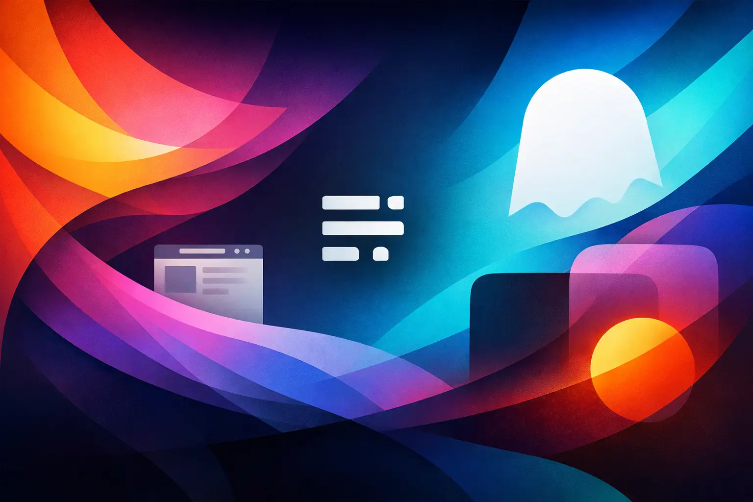
How to Choose a Minimal Ghost Theme

A clean homepage looks easy until you try to build one. Then the trade-offs show up fast - typography that feels too plain, layouts that look elegant in a demo but fall apart with real content, and theme settings that promise flexibility while adding friction. If you are looking for a minimal ghost theme, the real question is not how little it shows. It is how well it supports what you publish.
Minimal design works best when it is doing more than reducing visual noise. For writers, creators, and editorial teams, it should create focus, improve reading flow, and give your publication a stronger point of view. A good Ghost theme is not just sparse. It is structured, intentional, and capable of carrying your brand without making you fight the system.
What a minimal ghost theme should actually do
The word minimal gets overused. In practice, a minimal ghost theme should not feel empty or generic. It should create a clear visual hierarchy, let your content lead, and remove interface decisions that do not serve the reading experience.
That usually starts with typography. If the type scale is weak, the whole site feels weak, no matter how clean the layout is. Headlines need authority. Body text needs comfortable rhythm. Supporting elements like tags, dates, captions, and author blocks should be present without becoming visual clutter.
Spacing matters just as much. Minimal themes rely on restraint, which means every gap, margin, and alignment choice carries more weight. When spacing is handled well, the site feels calm and premium. When it is not, the same layout can feel unfinished.
A strong minimal theme also respects different publishing formats. Some sites are newsletter-first. Others depend on long-form essays, podcast posts, startup updates, or magazine-style archives. Minimalism should adapt to the format rather than flatten everything into the same presentation.
Why minimal works so well in Ghost
Ghost is already built around publishing. That makes it a natural match for minimal design, because the platform does not need heavy visual packaging to feel complete. The editor is streamlined, membership tools are integrated, and content structures are already oriented around posts, pages, authors, and subscriptions.
The benefit is clarity. A minimal Ghost site can feel polished quickly because the platform itself does not require layers of plugins or page-builder workarounds just to achieve a professional result. For independent publishers and lean teams, that matters. Less setup complexity means more attention can go into the publication itself.
There is also a brand advantage. Minimal design tends to age better than trend-heavy themes. If your site is built around strong type, balanced spacing, and thoughtful content templates, it is less likely to feel dated six months after launch.
The hidden difference between minimal and basic
This is where many buyers get stuck. A basic theme removes features. A minimal theme removes distraction.
Those are not the same thing. Basic themes often look clean in screenshots because there is not much there. But once you start adding featured images, multiple authors, newsletter CTAs, tags, or longer headlines, the design can lose control fast.
A well-crafted minimal ghost theme accounts for real publishing conditions. It handles content variation gracefully. It gives enough options to shape your brand, but not so many that setup becomes a design project in itself. It keeps the interface quiet while still supporting growth.
That balance is harder to get right than it looks. Good restraint takes more design discipline than visual excess.
How to evaluate a minimal ghost theme before you buy
Start with the demo, but do not stop at the homepage. Homepages are easy to style. The better test is the post page, tag archive, author page, and navigation behavior on mobile. If those templates feel resolved, the theme is probably built with real use in mind.
Look closely at headline length. Do long titles wrap well? Are excerpts visually balanced? Does the layout hold up when images are inconsistent or absent? Minimal designs are less forgiving when content structure varies, so resilience matters.
You should also check how the theme handles calls to action. If you plan to run memberships or newsletter signups, those elements should feel integrated into the design rather than bolted on. A clean site can still convert well, but only if subscription prompts are placed with care.
Customization is another factor. Most publishers do not need unlimited control. They need the right control. Color settings, typography options, logo treatment, navigation choices, and homepage sections should be enough to make the site feel branded without requiring code for basic decisions.
Support is worth weighing too. Even experienced Ghost users run into setup questions, migration issues, or small customization needs. A premium theme becomes more valuable when documentation is clear and the person behind the product actually helps customers move forward.
Design details that matter more than feature lists
Feature lists can be useful, but they rarely tell you why one theme feels refined and another feels off. The better signals are in the details.
The first is rhythm. Scroll through a demo and pay attention to pace. Do sections feel balanced, or does the page become repetitive? Minimal themes need variation in composition, even when the overall system stays restrained.
The second is image handling. Some publishers rely heavily on photography. Others barely use images at all. A thoughtful theme should work in both scenarios. If it only looks polished with perfect art direction, it may not be practical for everyday publishing.
The third is navigation clarity. Minimal navigation should feel effortless, not stripped down to the point of confusion. Readers should know where they are, how to browse archives, and where to subscribe without having to hunt.
Finally, look at tone. Design communicates before the first sentence is read. Some minimal themes feel soft and literary. Others feel sharper and more product-oriented. Neither is automatically better. The right choice depends on whether your publication wants to feel like a journal, a newsroom, a founder brand, or a modern studio.
When a minimal ghost theme is the wrong choice
Minimal is not the answer for every publication. If your site depends on dense category navigation, heavy monetization modules, comparison tables, or a large amount of utility content above the fold, an ultra-restrained theme may work against you.
The same goes for brands that need strong visual personality through motion, illustration, or layered campaign storytelling. A minimal framework can support a strong brand, but it does so through subtlety. If your strategy depends on loud differentiation, you may want a more expressive layout system.
It also depends on your content habits. Minimal themes reward editorial consistency. If your posts vary wildly in tone, image use, and structure, the site can feel less cohesive. That is not always a theme problem. Sometimes it is a publishing workflow problem.
The best minimal themes feel invisible for the right reasons
When a theme is working, you stop noticing it. Readers focus on the article. Subscribers move naturally toward the signup form. The brand feels clear without pushing too hard. That kind of invisibility is not generic. It is a result of careful design decisions holding everything together quietly.
For Ghost users, that is often the sweet spot. You want enough sophistication to look established, enough flexibility to shape the site around your content, and enough simplicity to keep publishing easy. A minimal Ghost theme should help you get there faster, not give you another system to manage.
That is why the strongest options tend to come from designers who understand editorial design, not just theme packaging. At Themex Studio, that design philosophy shows up in themes that feel restrained but never empty, flexible but never messy, and polished without becoming difficult to use.
Choosing a theme is partly aesthetic, but it is mostly operational. You are choosing the structure your content will live in for months or years. Pick the one that makes your writing look sharper, your brand feel clearer, and your publishing process feel lighter. The best minimal design leaves room for your work to matter more.
Become a subscriber receive the latest updates in your inbox.