Enjin Docs

Introduction
The theme's core concept is for content-first creators who want to build a subscriber-based publication around deep, research-driven content in arts, culture, history, tech, lifestyle. This is a solid, professional theme with strong editorial design, strong visual hierarchy. This is also a highly customizable Ghost theme.
Since this is a Ghost theme documentation, you are assumed to have a basic knowledge of the Ghost CMS. If you're starting with Ghost, it is best to see the guides in the official Ghost Help Center – check this out, and you'll have all the available information.
Getting started
Welcome
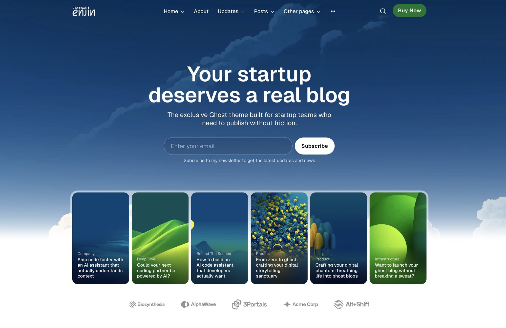
Enjin is built on a simple philosophy: your content deserves to be presented like it matters. This theme gives you the structure of a professional magazine with the flexibility to make it unmistakably yours. Change colors, swap fonts, adjust imagery—the foundation remains solid: organized, readable, and designed to build an audience.
Install theme
Upload zip file
To begin, unzip the downloaded package by double-clicking it on a Mac or by right-clicking and selecting "Extract All" on Windows.
Inside the new Enjin folder, you will find the Enjin.zip theme files.
Step-by-Step to Upload the Theme to Your Website
- Log in to your Ghost website admin (example.com/ghost).
- Click the settings icon ( ⚙️ ) at the bottom of the left-hand side.
- Go to Design & branding > Theme > Change theme.
- Click Upload theme and select the Enjin.zip theme file.
- Once uploaded, click Activate now to activate the theme.
General settings
Colors
The theme supports changing the Accent color and offers different color combinations.
Set accent color
The Accent color is the primary color used throughout your publication theme in buttons, social sharing hovers, links, and other interactive elements. You can change the theme Accent color from the Ghost admin.
Change the Accent color from the admin Settings > Design & Branding > Customize > Brand > Accent color.
Preset color combinations
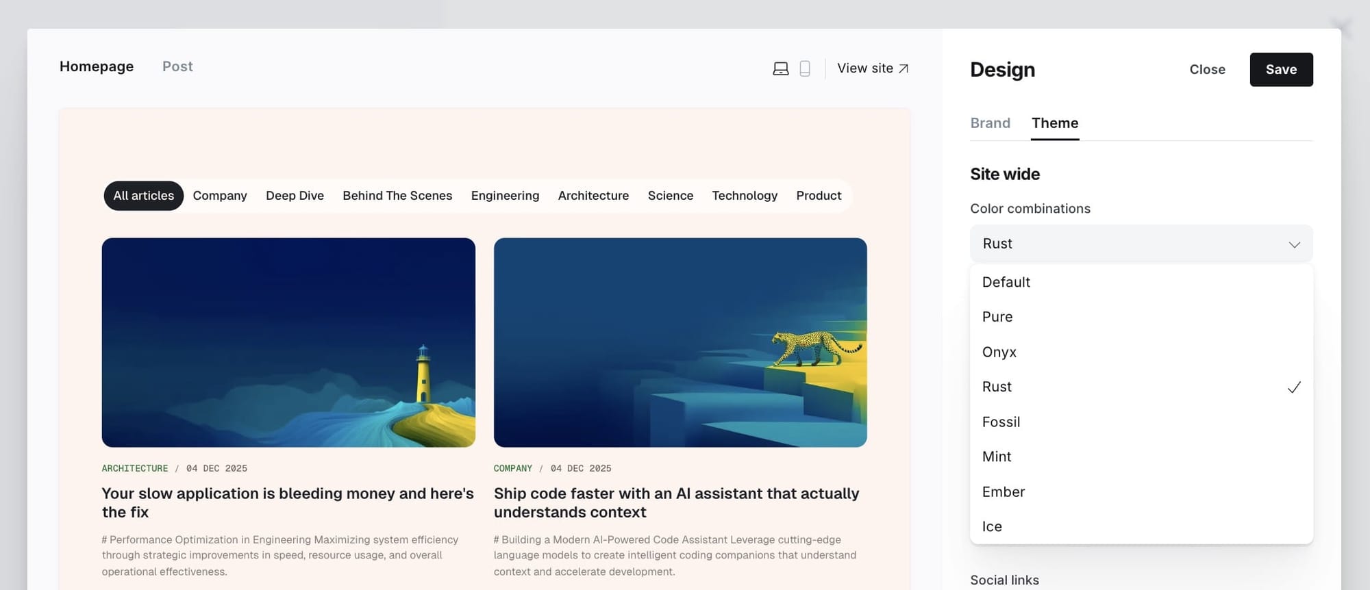
The theme provides 8 different color combinations. Choose the one that fits your style:
- Default - Classic and versatile color scheme
- Pure - Clean, minimalist black and white
- Onyx - Deep, sophisticated dark tones
- Rust - Warm, earthy palette
- Fossil - Natural, muted tones
- Mint - Fresh, cool greens
- Ember - Warm, energetic oranges
- Ice - Cool, crisp blues
Step-by-Step to Choose Your Preferred Color Combination:
- Go to the admin Settings > Design & Branding > Customize > Theme.
- Click on Color combinations and select your color combination.
- Preview and Save.
![TK: Color combination options]
Light / dark mode
You can easily switch between light, dark, system, or user-defined modes directly from your Ghost admin panel.
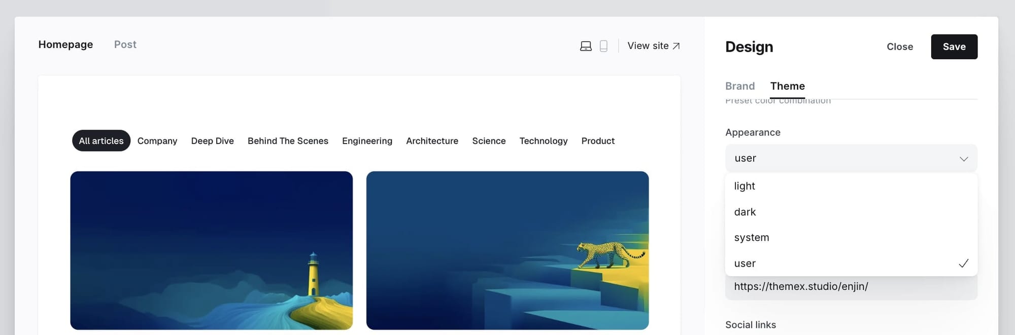
The theme supports:
- Light - Always display light mode
- Dark - Always display dark mode
- System - Automatically match the user's operating system preference
- User defined - Allow users to toggle between light and dark mode with their preference saved
Step-by-Step to Customize
- Go to Settings > Design & branding > Theme from the admin menu
- Choose a preferred mode by clicking on Appearance
- Click Save
![TK: Light/dark mode settings]
Note: When set to "User defined", a theme toggle button appears in the header allowing visitors to switch between light and dark modes. Their preference is saved locally.
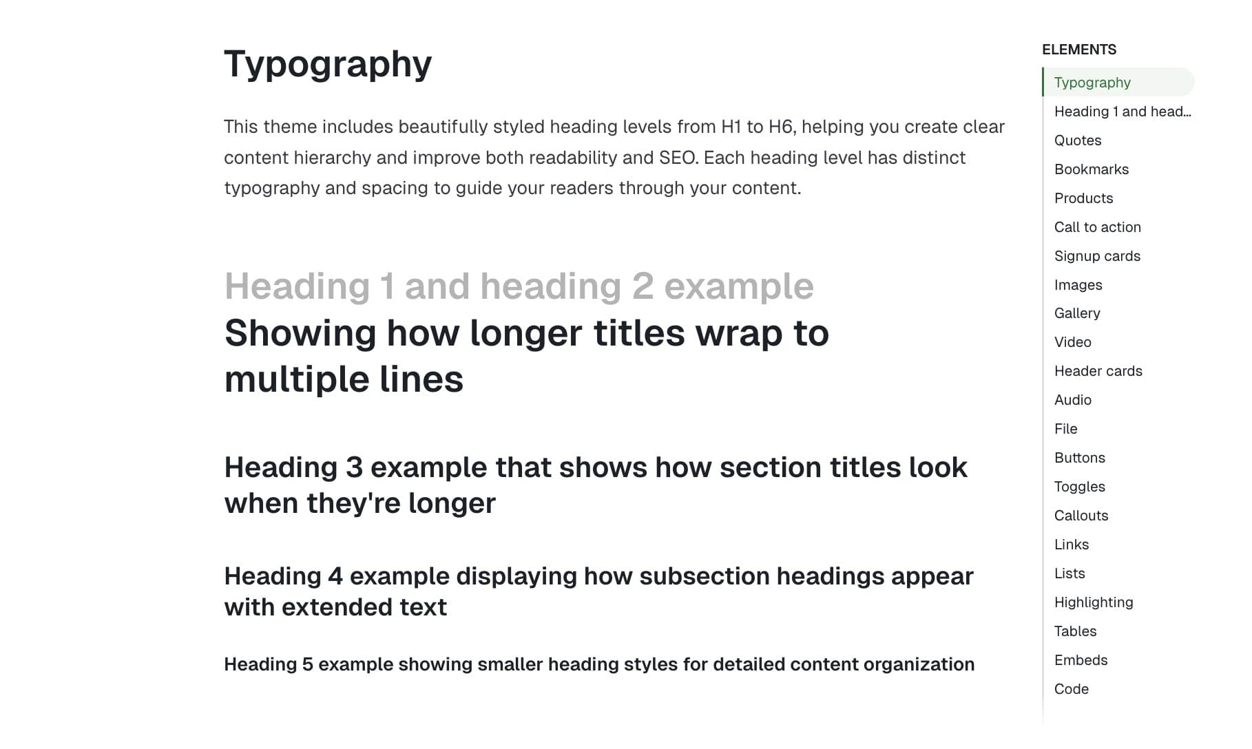
Typography
Depending on the selected option, this setting will change the heading and body text fonts.
Custom fonts
Ghost provides built-in custom font functionality, allowing users to select heading and body fonts from a curated list directly in the admin interface.
Step-by-Step to Change Fonts:
- Go to Settings > Design & branding > Customize > Brand
- Under Typography, select:
- Title font for headings
- Body font for main text
- Click Save
![TK: Typography settings]
Host your own fonts
You can change any font from the Ghost admin interface using Code Injection and Google Fonts, or your own font. For example, if you want to use "EB Garamond" fonts from Google Fonts, your code in Code Injection will be:
<link href="https://fonts.googleapis.com/css2?family=EB+Garamond:wght@500&family=Inter:wght@400;700&display=swap" rel="stylesheet">

<style>
  :root {
    --font-base: 'EB Garamond', serif;
  }
</style>
You can also use your custom local font by including it in your theme with a code editor. This technique is more advanced but allows you to add 'your own' fonts.
Check out the detailed guide to add your own fonts
Header navigation
Step-by-Step to Add an Item to Header Navigation:
- Go to Settings > Navigation > Primary Navigation.
- Type the page's name in the label field as you'd like it to appear on your menu.
- Click on the item's URL. The blog URL will already be auto-populated.
- When satisfied with your page configurations, click the Save button.
Navigation dropdown menus
You can create dropdown sub-menus in your Ghost site navigation to organize your content more effectively and improve site navigation. This feature helps visitors quickly find specific pages under broader categories.
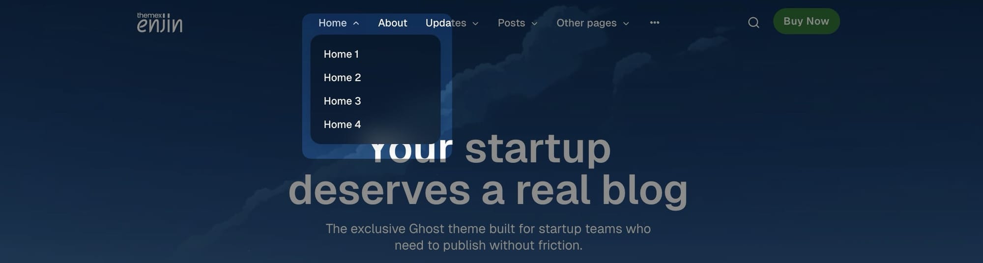
Follow these steps to set up dropdown navigation menus:
- In your Ghost Admin panel, go to Settings → Navigation
- Add your main menu items normally
- To create submenu items, add them with a dash (-) prefix before the child item
- Arrange items in the order you want them to appear
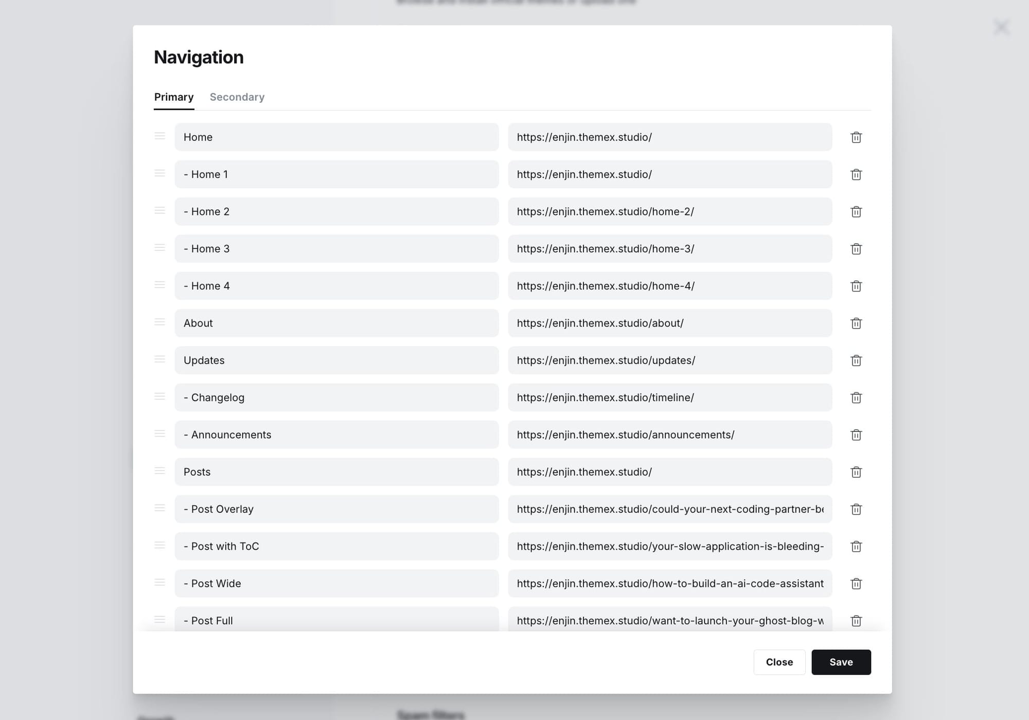
Example Settings:
Home          /
About         /about
- Team        /team
- Contact     /contact
Blog          /blog
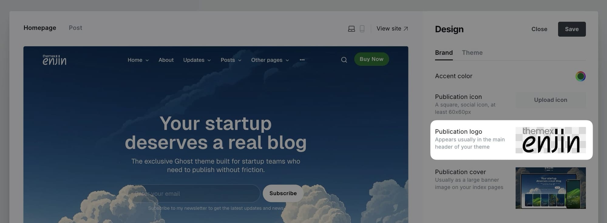
Header logo
Header profile displays Publication logo from Settings → Design & branding → Brand → Publication logo. If no logo is uploaded, the site title will display instead.
Header call-to-action button
You can add your own CTA text and link in the header. If you leave it empty, the button will be hidden.
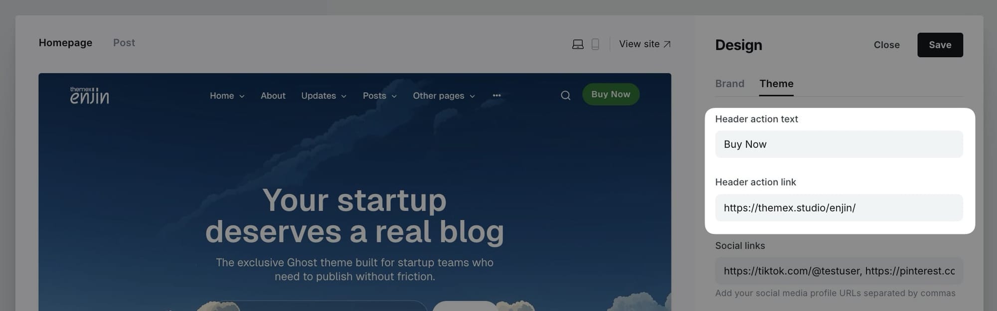
Step-by-Step to Add Header CTA:
- Go to Settings > Design & branding > Theme
- Scroll to Header action text:
- Add the text to Header action text. Leave it empty if you want to hide it.
- Add link to Header action link
- Click Save
Example configurations:
- Contact button:
- Text: "Contact Us"
- Link: "/contact"
- External link:
- Text: "Get Started"
- Link: "https://example.com/start"
White logo on dark mode
If you use a black logo image and enable dark mode, you would need your logo visible when users enable dark mode.
You can use Code injection and insert this CSS to support different logo color on light/dark mode
<style>
:root[data-theme=dark] .head-logo-wrap img {
    filter: invert(100%);
}
</style>
Footer
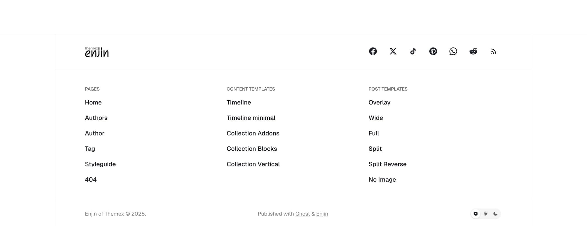
Like the header, you can add the footer navigation links from the Ghost Admin Settings > Navigation > Secondary
To group footer items into different groups, add # before the name.
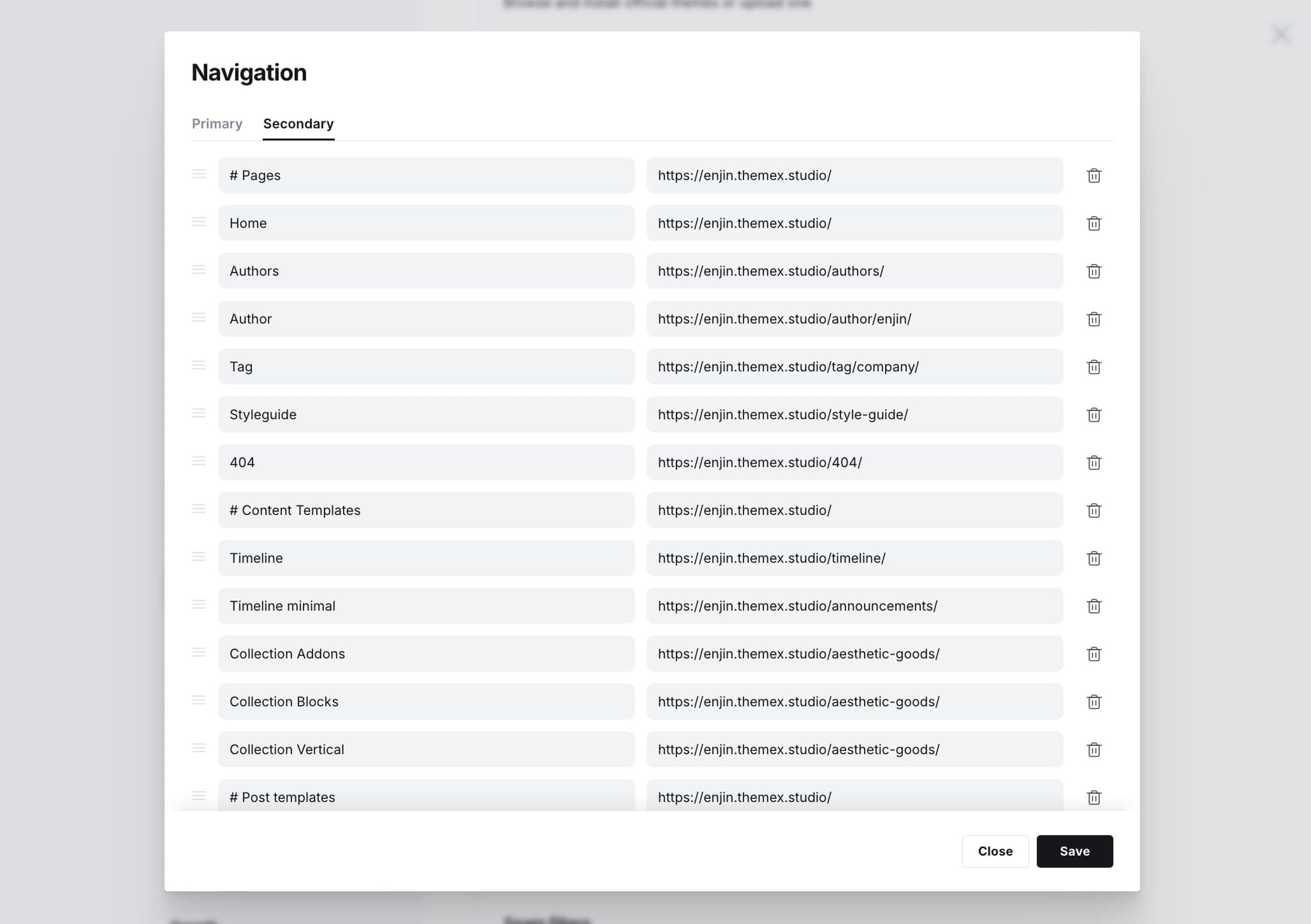
Example configuration:
#Company
About Us      /about
Careers       /careers
#Legal
Privacy       /privacy
Terms         /terms
Footer social links
The Enjin theme includes a comprehensive global social links system that automatically detects and displays social media icons from URLs you provide. The social links appear in the hero section (when enabled) and in the footer, providing consistent social presence across your site.
Simply paste the full URL to your profile on any supported platform. The theme will automatically detect the platform and display the correct icon. No need to specify the platform name or icon.

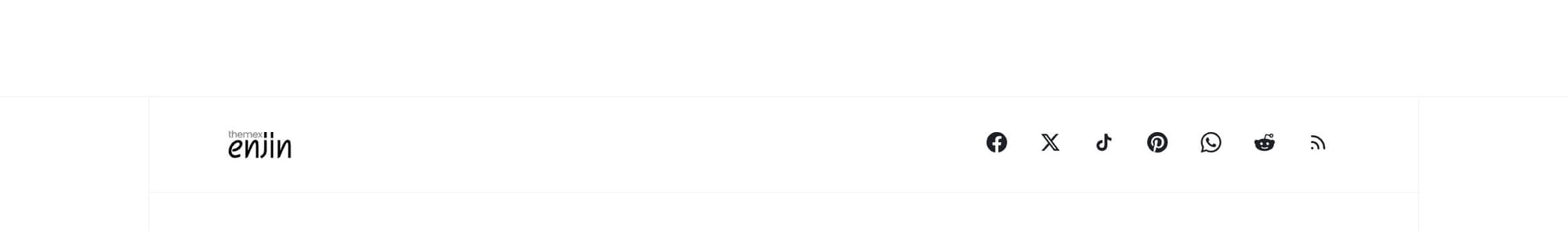
Supported platforms
The theme automatically recognizes and displays icons for 40 platforms, including:
Social media: Instagram, Threads, Facebook, Twitter/X, LinkedIn, TikTok, Bluesky, Mastodon, Pinterest, Reddit, Snapchat, WeChat
Professional: GitHub, Dribbble, Behance, Medium, Stack Overflow, CodePen
Media: YouTube, Vimeo, Spotify, Apple Podcasts, SoundCloud, Twitch
Communication: Email, Phone, WhatsApp, Telegram, Discord, Slack
Business: Etsy, Amazon, Ko-fi, Patreon, Trustpilot, Yelp, TripAdvisor, Google Maps
And more... The system automatically detects the platform from your URL and displays the appropriate icon.
Step-by-step to add social links
- Go to Settings > Design & branding > Theme
- Find the Social links field in the theme settings
- Add your social media profile URLs separated by commas
- Example:
https://twitter.com/yourusername, https://instagram.com/yourusername, https://github.com/yourusername - Click Save
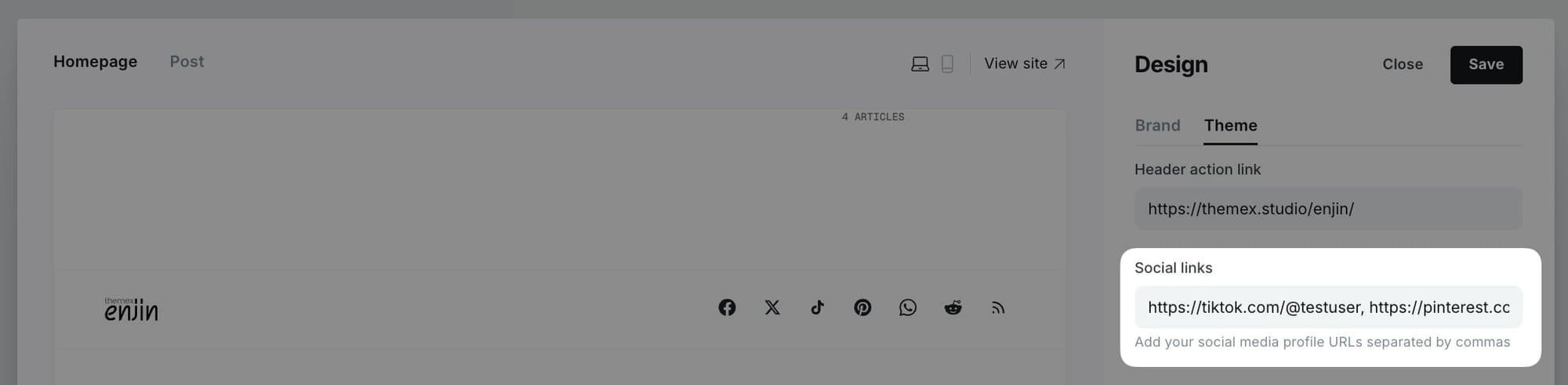
Display locations
Social links appear in two locations:
- Hero section - When you select "Social links" in the Hero actions dropdown (Settings > Theme > Homepage > Hero actions)
- Footer - Social links always appear in the footer alongside your traditional Ghost social links (Facebook, Twitter)
Adding special link types
Email links:
- Add
mailto:[email protected]or just[email protected] - The theme will automatically display an email icon
Phone links:
- Add
tel:+1234567890or just+1234567890 - The theme will automatically display a phone icon
Custom URLs:
- For platforms not automatically recognized, add the URL anyway
- The theme may display a generic link icon or skip unsupported platforms
Homepage
Homepage overview
The Enjin theme homepage is designed for flexibility and easy customization. You can build a dynamic homepage using Ghost's built-in features, managing sections directly from the Ghost admin interface—no coding required!
The homepage consists of several key sections:
- Hero Section - Introduction with site title/description or custom content
- Featured Posts - Highlighted content with auto-generated color backgrounds
- Latest Posts - Recent articles feed
- Category Navigation - Tag-based navigation bar for content exploration
- Tag-based Posts Sections - Curated collections grouped by topic tags (configured via theme settings)
- Posts by Category - Tag-filtered content sections (configured via pages)
- Additional Sections - Logos, testimonials, authors, static text, custom content
All sections are fully customizable through the Ghost admin panel.
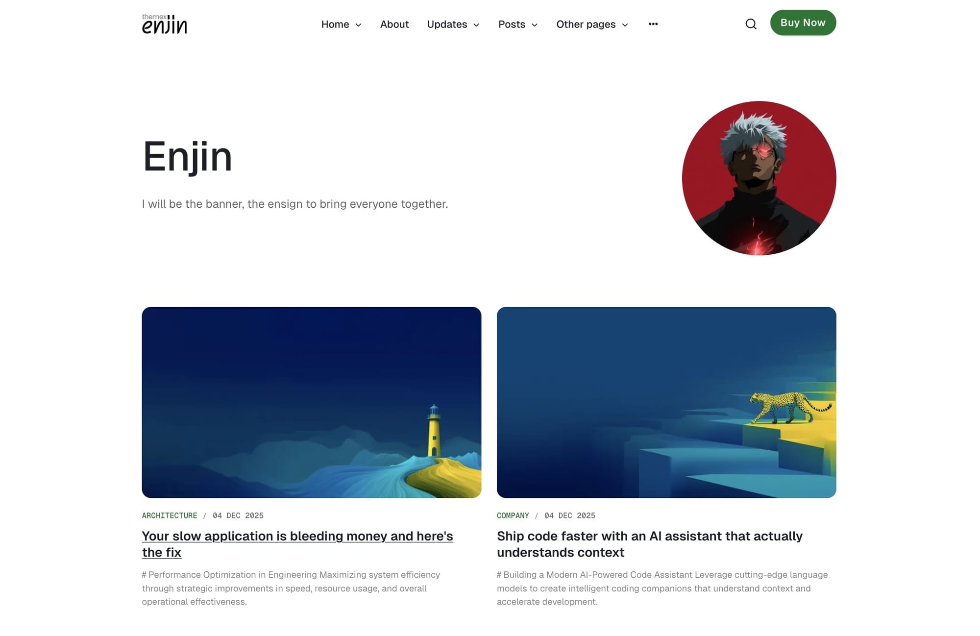
Hero section
The hero section is the first thing visitors see on your homepage. It displays a customizable heading and description that you can set directly in your theme settings.
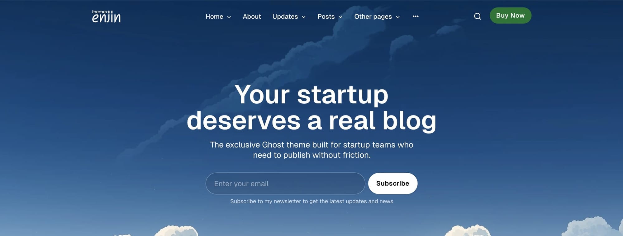
Step-by-step to customize hero content
- Go to Settings > Design & branding > Theme > Homepage
- Find the Hero heading field and enter your main hero title
- Find the Hero description field and enter your supporting text
- Click Save
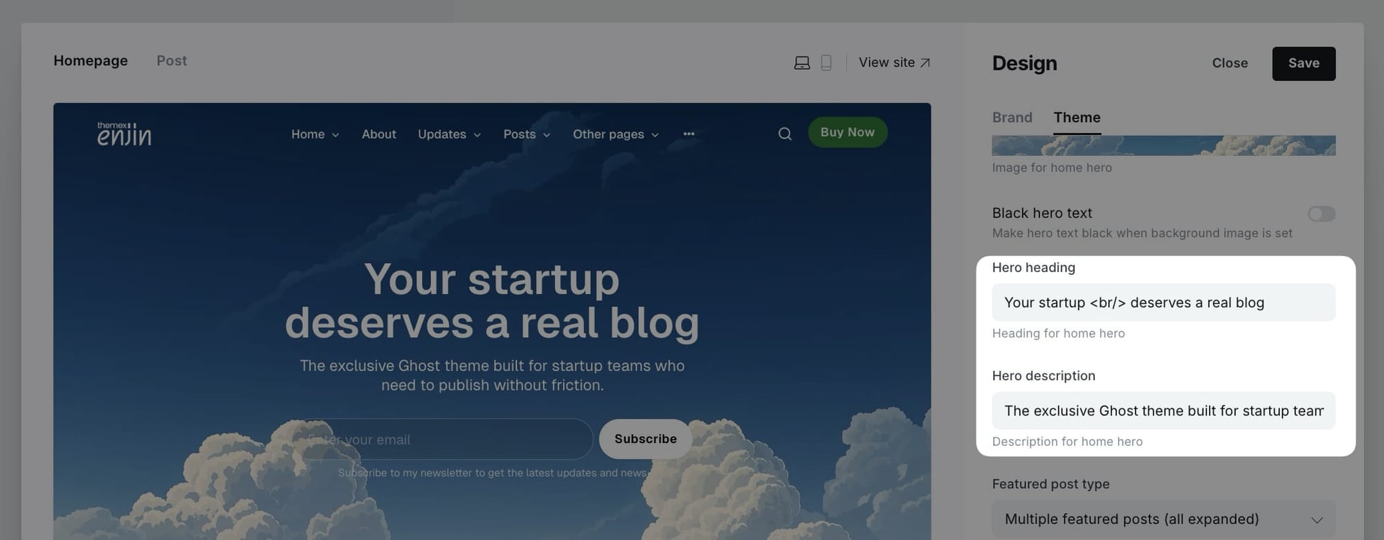
Note: Both the heading and description fields support HTML formatting. You can use tags like<strong>,<em>, or<br>for text formatting if needed.
Hero background image
Add a stunning visual background to your hero section to create a more impactful first impression. The hero background image feature lets you upload a custom image that spans the full width of the hero section.
The theme comes with a set of beautiful, minimal and text-ready background to use. You can download it from here:
 Trong Themex
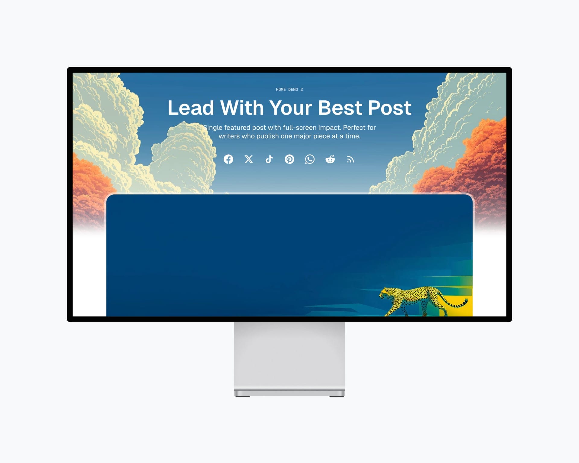
Step-by-step to add hero background image
- Go to Settings > Design & branding > Theme > Homepage
- Find the Hero background image option
- Click Upload and select your background image
- The image will automatically be displayed at responsive sizes (up to 1920px wide)
- Click Save
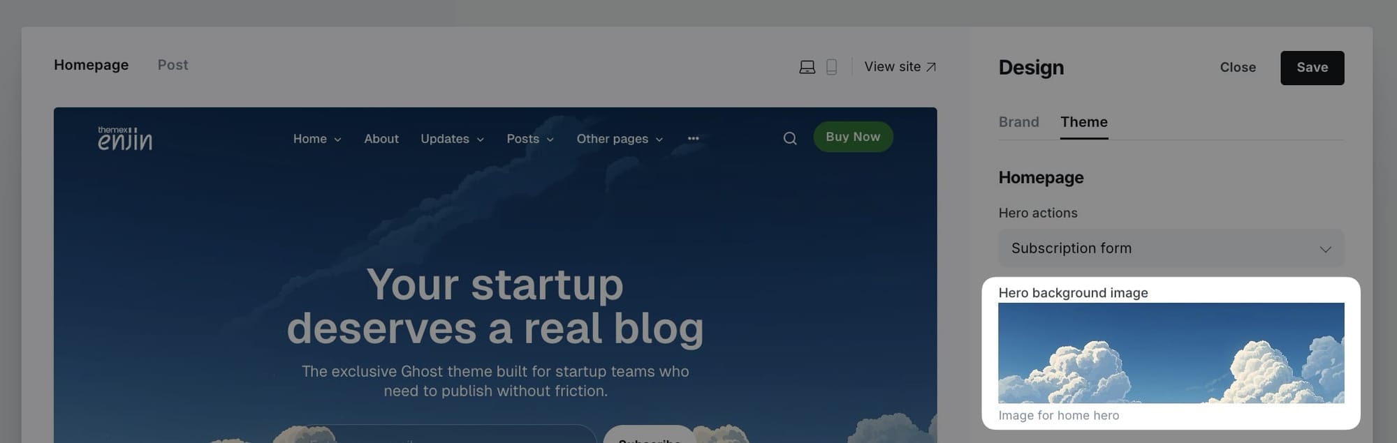
Tip: For best results, use high-quality images with at least 1920px width. Images with subtle patterns or soft gradients work well as backgrounds.
Black hero text option
When you use a hero background image, you might find that your hero text isn't easy to read depending on the image's colors. The black hero text option allows you to change the hero text color to black for better readability on light-colored background images.
Step-by-step to enable black hero text
- Go to Settings > Design & branding > Theme > Homepage
- Find the Black hero text toggle
- Enable it by switching the toggle to ON
- Click Save
Note: This option only works when you have a hero background image set. Use this when your background image is light-colored and the default white text is hard to read.
Hero actions
Choose to show social links, subscription box, or nothing below the hero content.


Step-by-step to set hero action
- Log in to your Ghost Admin dashboard.
- Go to Settings → Site → Design & branding → Customize
- Go to Theme tab and find the Homepage section.
- Locate the Hero actions dropdown, select the option you want:
- Social links: Display your global social links configured in theme settings (see Social links section)
- Subscription form: Display the subscription box
- None: No action shown
- Save and refresh the homepage
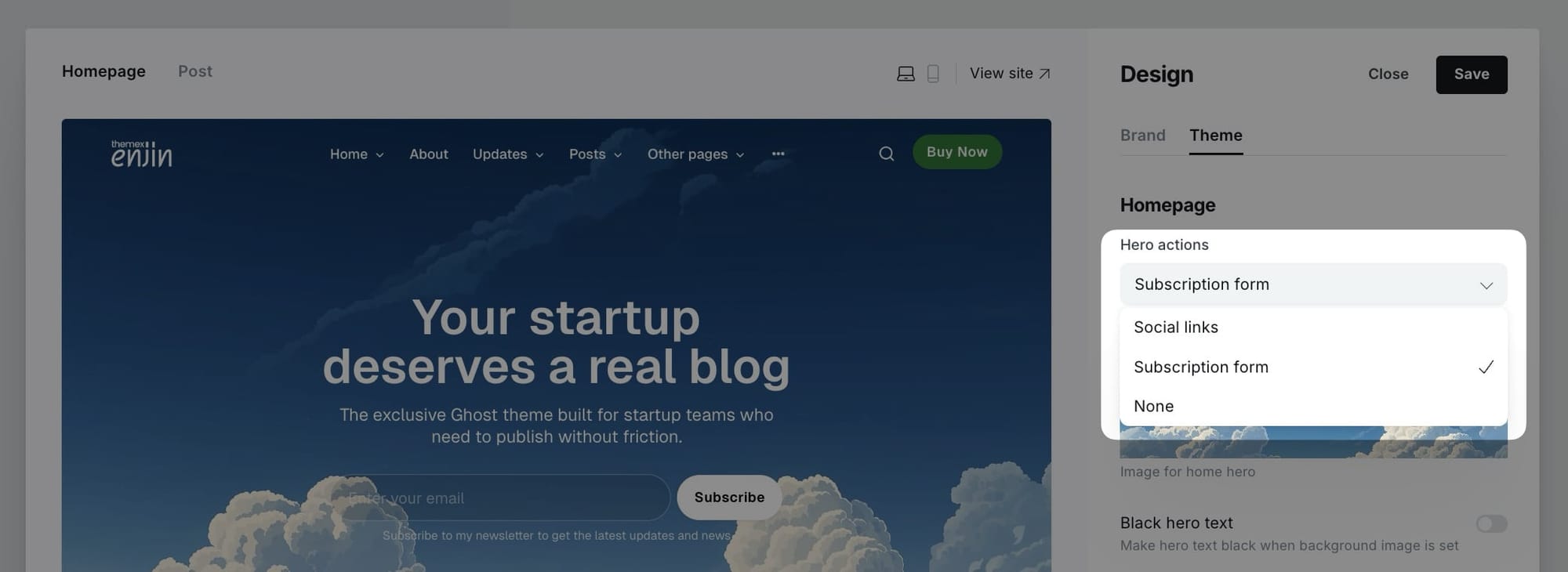
Note: To configure which social links appear, see the Social links section in General settings. The social links system supports 40+ platforms and automatically detects icons from URLs.
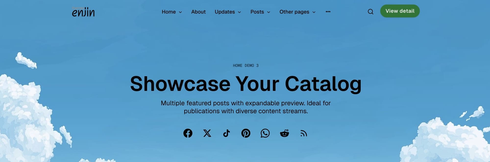
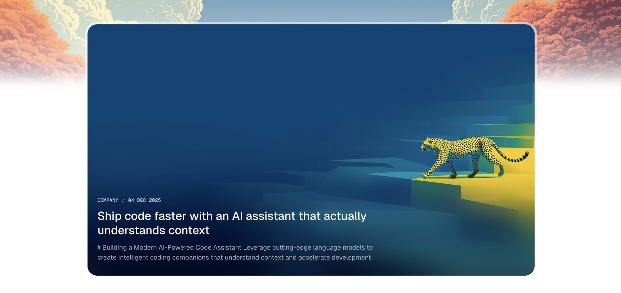
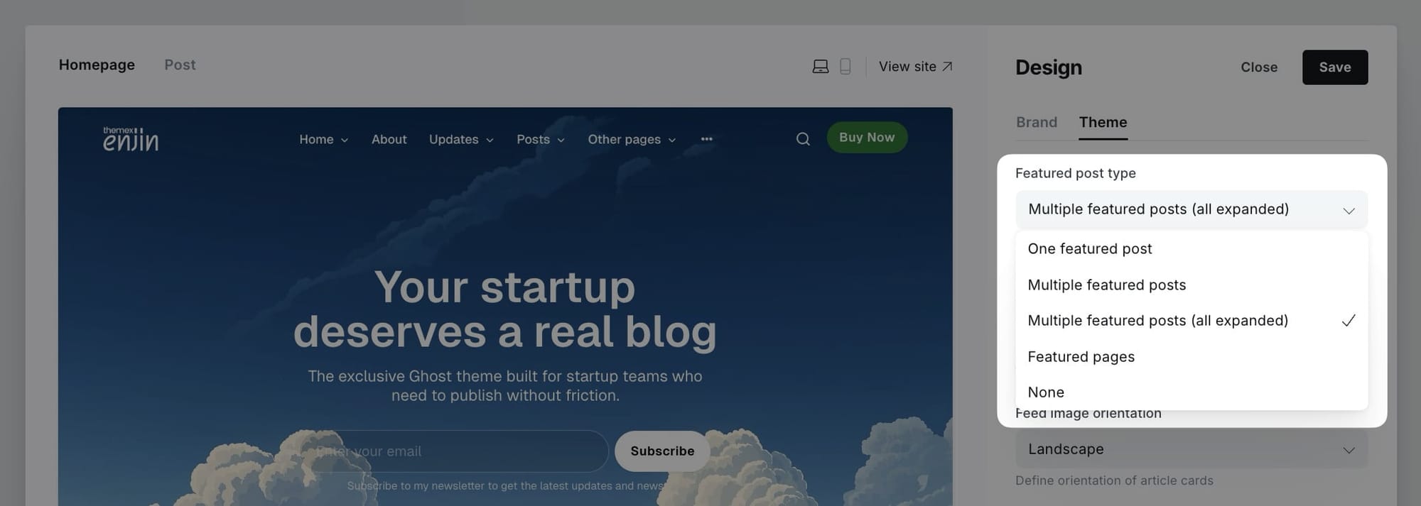
Featured posts section
The featured posts section displays prominent content at the top of your homepage with multiple display options. You can showcase a single featured post, multiple featured posts in a grid, or even featured pages.
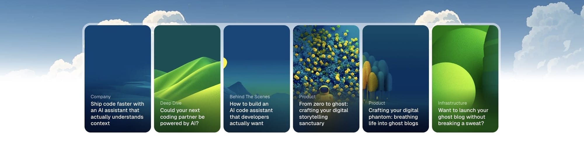
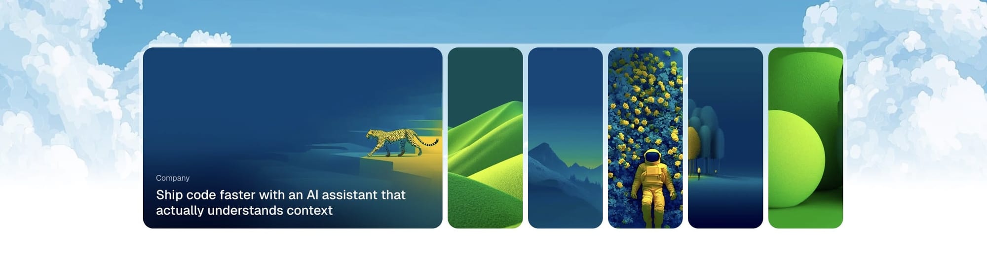
Enjin offers five options for the featured posts section:
- One featured post - Display a single large featured post card
- Multiple featured posts - Show multiple featured posts in a compact grid (first post expanded, others collapsed)
- Multiple featured posts (all expanded) - Show multiple featured posts with all cards fully expanded
- Featured pages - Display featured pages instead of posts (useful for portfolios, case studies, or static content)
- None - Hide the featured section completely
Step-by-step to configure featured posts
- Go to Settings > Design & branding > Theme > Homepage
- Find Define type of featured posts dropdown
- Select your preferred option:
- One featured post - Displays one large featured post with full details
- Multiple featured posts - Shows a grid with the first post expanded and others as smaller cards
- Multiple featured posts (all expanded) - Shows all featured posts as large expanded cards
- Featured pages - Shows pages marked as featured instead of posts
- None - Hides the featured section entirely
- Click Save
How to mark content as featured
For posts:
- Go to Posts in Ghost admin
- Click on the post you want to feature
- Click the settings icon (⚙️) in the top right
- Toggle Feature this post to ON
- Update the post
For pages:
- Go to Pages in Ghost admin
- Click on the page you want to feature
- Click the settings icon (⚙️) in the top right
- Toggle Feature this page to ON
- Update the page
Tip: Use "One featured post" for a bold, magazine-style homepage. Use "Multiple featured posts" for a more dynamic layout with several highlights. Choose "Featured pages" when you want to showcase portfolio work, case studies, or evergreen content instead of blog posts.
Tag navigation bar
The tag filter navigation system is one of Enjin's most powerful features for content discovery. It displays a horizontal navigation bar with your chosen tags, allowing visitors to filter and explore posts by topic without leaving the homepage.

The tag filter navigation is JavaScript-powered and provides a smooth, fast filtering experience with:
- Dynamic post loading without page refresh
- Smooth scroll navigation for long tag lists
- Skeleton loading states for visual feedback
- "View all" button for filtered tag archives
- Automatic tag selection or custom tag curation
Setting up tag filter navigation
You have two options for configuring which tags appear in the navigation bar:
Option 1: Automatic selection (default)
- Leave the tag settings empty
- The theme automatically displays your top 8 tags by post count
- Perfect for getting started quickly
Option 2: Custom tag selection (recommended)
- Manually select which tags to display
- Control the order of tags
- Better for curated content experiences
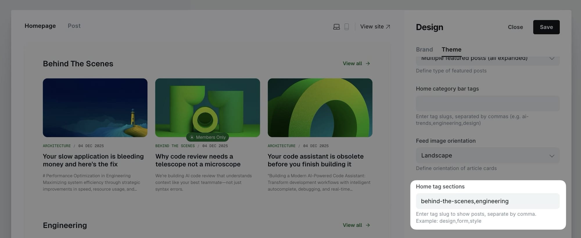
Step-by-step to customize tag filter navigation
- Go to Settings > Design & branding > Theme > Homepage
- Find Home category bar tags field
- Enter tag slugs separated by commas (no spaces)
- Example:
ai-trends,engineering,design,product,marketing - Click Save
Tip: To find the exact tag slug, go to Tags in the Ghost admin, click on the tag name, then copy the text in the Slug field. The slug is the URL-friendly version of your tag name (e.g., "AI Trends" becomes "ai-trends").
All articles posts
The All articles section displays your most recent blog posts in a grid layout with pagination. This is typically the main content area of your homepage, showing your newest published content.
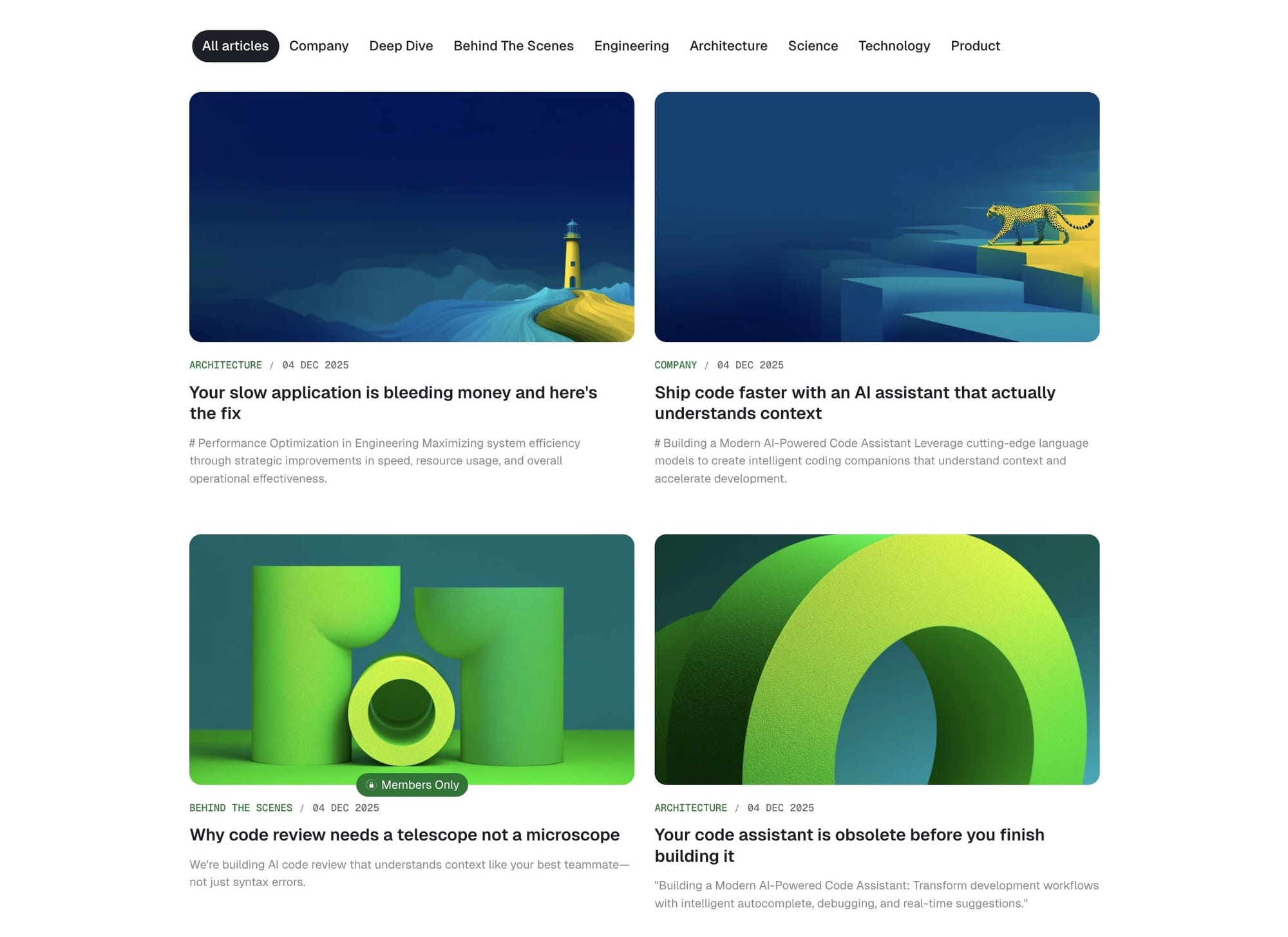
The latest posts section includes:
- Grid layout with your recent posts
- Automatic pagination for older posts
- Integration with tag filter navigation
Feed image orientation
Control the aspect ratio of post card images throughout your site.
Step-by-Step to Set Image Orientation
- Go to Settings > Design & branding > Theme > Homepage
- Find Feed image orientation
- Select your preferred option:
- Landscape - Horizontal rectangular images
- Square - Equal width and height
- Portrait - Vertical rectangular images
- Free - Original aspect ratio maintained
- Click Save
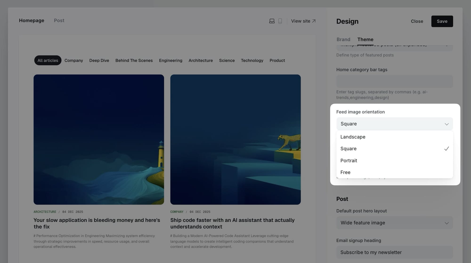
Note: This setting applies to post cards throughout the site, including homepage, blog page, tag pages, and related posts.
Customizing posts per page
By default, the homepage displays 12 posts per page. You can change this number by editing your theme's package.json file.
Step-by-step to change posts per page
- Download your theme from Ghost admin (Settings > Design & branding > Theme > Advanced > Download)
- Unzip the theme folder
- Open
package.jsonin a text editor - Find this section:
"config": {
    "posts_per_page": 12
}
- Change
12to your preferred number (e.g.,9,15,18) - Save the file
- Re-zip the theme folder
- Upload and activate the theme in Ghost admin
Tip: Choose numbers that divide evenly into your grid layout. For a 3-column grid, use multiples of 3 (6, 9, 12, 15). For a 2-column grid, use even numbers (6, 8, 10, 12).
Note: The posts per page setting affects pagination throughout your site, including tag pages, author pages, and the blog page.
Logo wall section
Sometimes you want to show some kind of social proof, and a logo board can help achieve that. Display partner logos, client logos, or featured brands.

Step-by-Step to Add Logo Wall
- In the Ghost admin page, go to Pages > click on New page.
- Enter the title of the page. This title will be the section title on the homepage.
- Upload all logos you want to show on the homepage as images in the page content.
- Important: Don't add any line breaks above, between, or after the images. It will create odd alignment.
- In the Page Setting sidebar, add a tag named:
#section-logos. (with#symbol) - Publish and check your homepage.
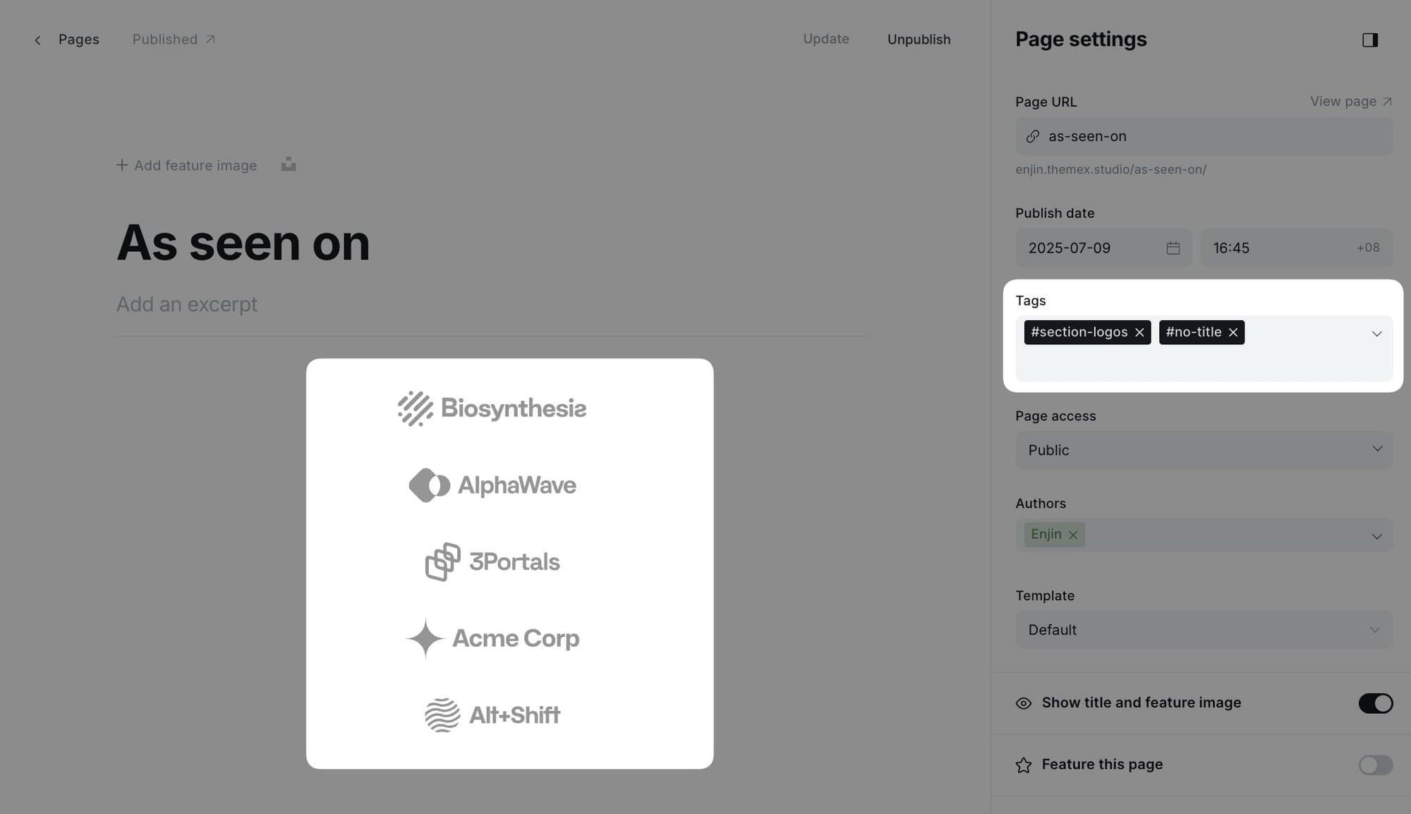
Tip: If you want to hide the section title, add #no-title tag to the page.Testimonials section
Display testimonials from your users, clients, or partners in a rotating slider format.
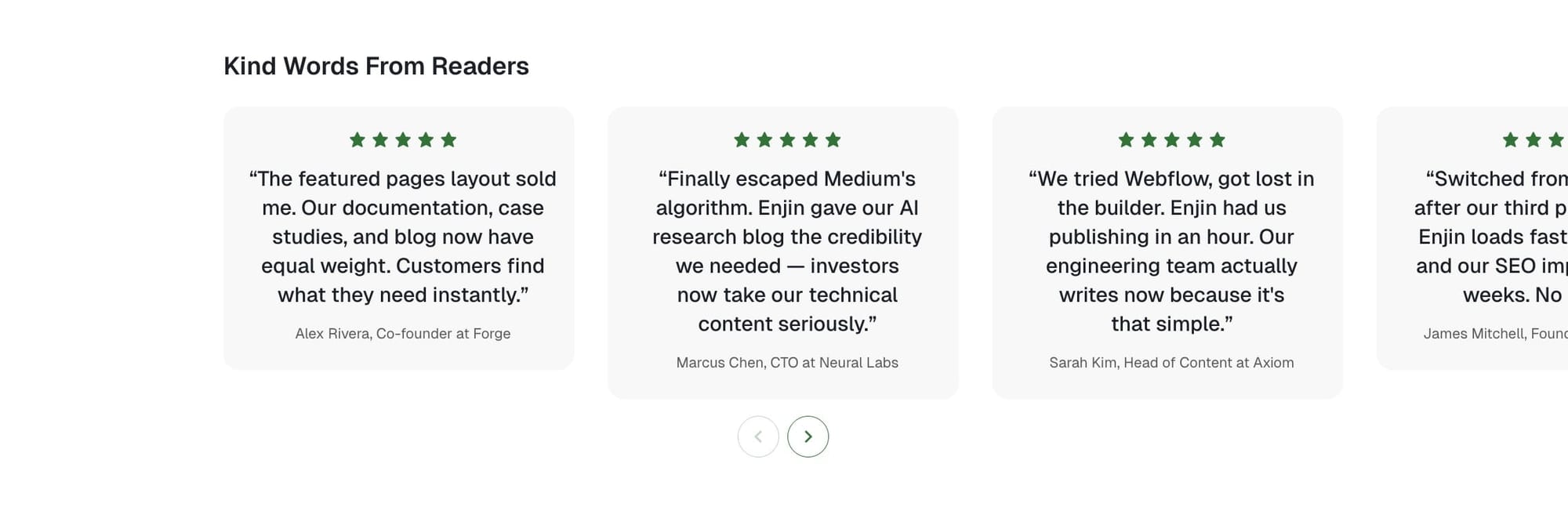
Step-by-Step to Add Testimonial Section
- In the Ghost admin page, go to Pages > click on New page.
- Enter the title of the page. This title will be the section title on the Homepage.
- Add
#section-testimonials(with#symbol) to the Tags field. - In the page content, add a new Product card. You can find this card by clicking on the + icon on the left side of the editor or by typing
/productin the editor, then select the Product option. - On the product card, fill in the details:
- Title - The testimonial main text
- Description - Person's name and job title
- Image - Profile picture
- Stars - Rating (1-5 stars)
- Add more Product cards to add more testimonials.
- Publish.
Static text section
The static text section is useful for adding custom text on the homepage, such as your services, working principles, or values.
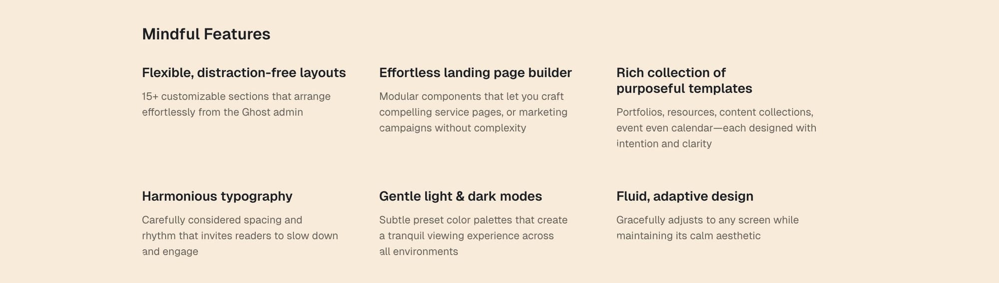
Step-by-Step to Add Static Text Section
- In the Ghost admin page, go to Pages > click on New page.
- Enter the title of the page. This title will be the section title on the Homepage.
- Add
#section-static-text(with#symbol) to the Tags field. - In the page content, add a new Product card. You can find this card by clicking on the + icon on the left side of the editor or by typing
/productin the editor, then select the Product option. - On the product card, fill in the title, description, image, and link (optional).
- Add more Product cards to add more static text cards.
- Publish.
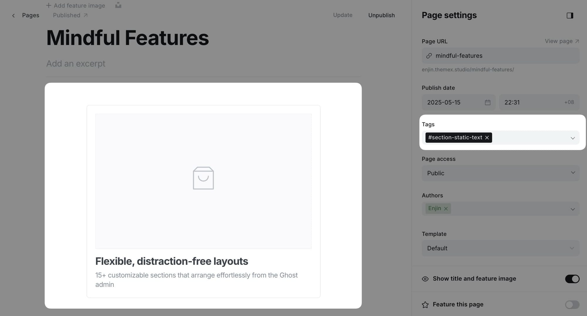
Tip: If you want to hide the section title, add #no-title tag.If you want to create multiple sections using Static text, create a new page and repeat the same steps above.
Static banner section
Similar to the static text section, the static banner section displays custom formatted content on the homepage. Use this for important banners, callouts, or announcements.
Step-by-Step to Add Static Banner Section
- In the Ghost admin page, go to Pages > click on New page.
- Enter the title of the page. This title will be the section title on the homepage.
- Add
#section-static-bannerto the Tags field. - In the page content, add your banner content using text, images, HTML cards, or other elements.
- Add more content blocks as needed for your banner layout.
- Publish.
Tip: If you want to hide the section title, add #no-title tag.If you want to create multiple banner sections, create a new page and repeat the same steps above.
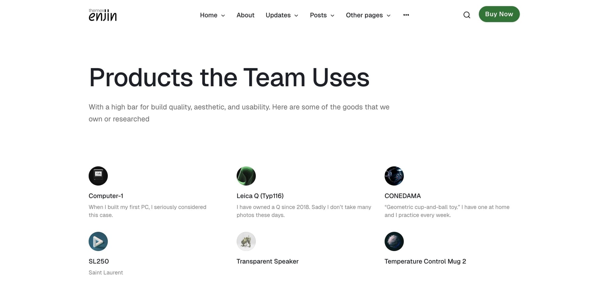
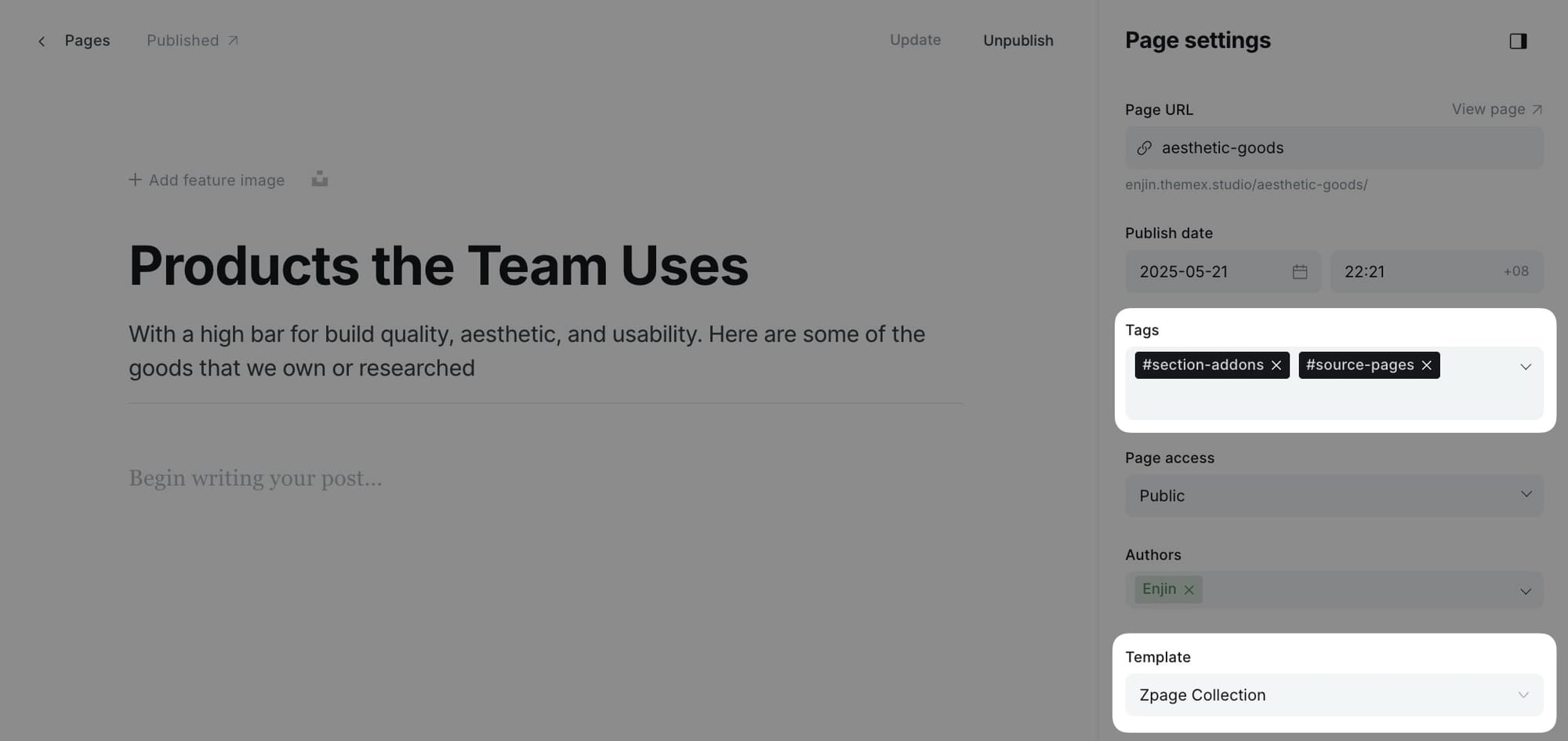
Add-ons section
Display resource cards, tools, or add-ons in a 3-column grid layout. This section is perfect for showcasing supplementary resources or plugins.
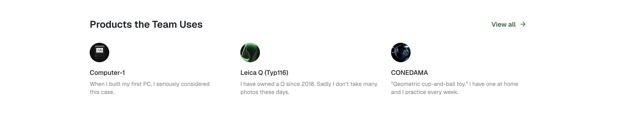
Step-by-Step to Add Add-ons Section
- In the Ghost admin page, go to Pages > click on New page.
- Enter the title of the page. This title will be the section title on the homepage (e.g., "Resources" or "Tools").
- Add
#section-addonsto the Tags field. - In the Twitter description field, enter the tag slug for posts or pages you want to display (e.g.,
resources).- Leave empty to show no items
- Add the tag
#source-pagesif you want to filter pages, or leave it to filter posts (default) - (Optional) To add a separate page for this content, select ZPage Collection in Page settings / Template
- Publish.
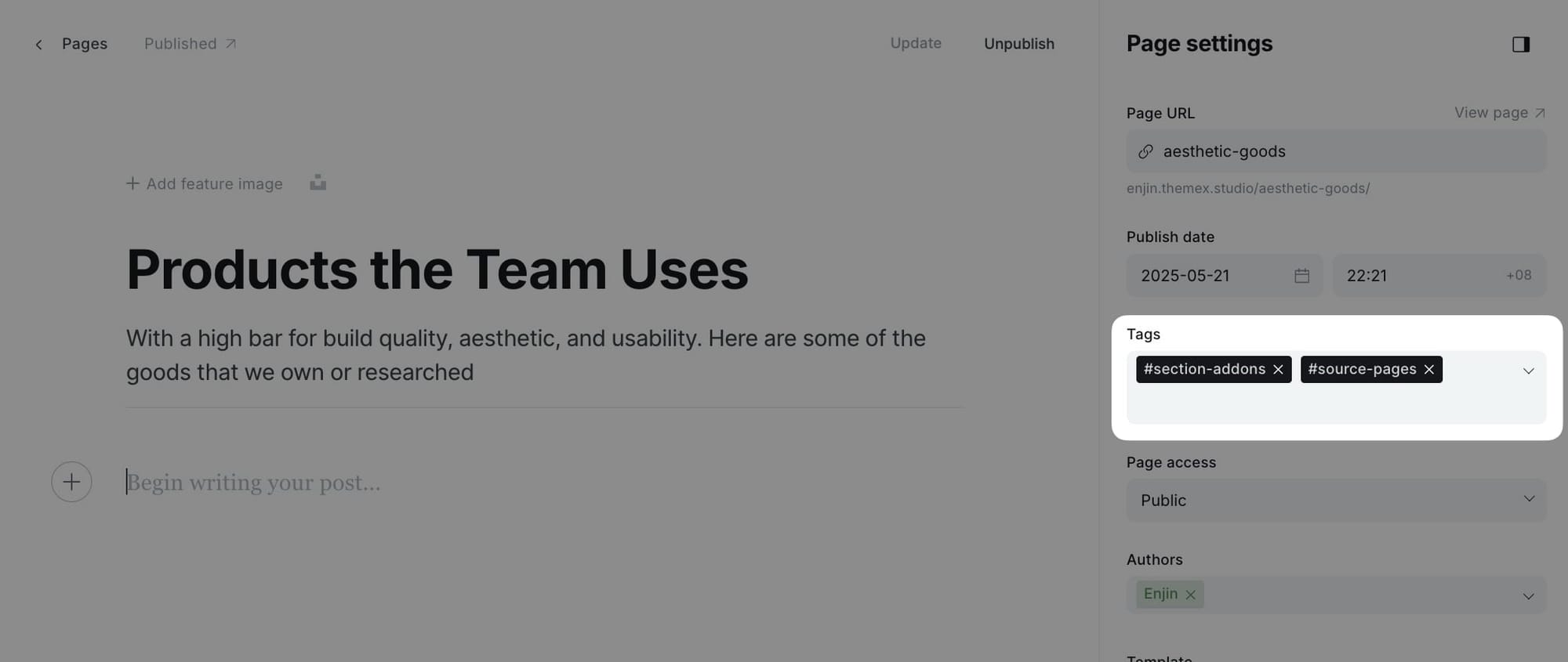
Note: If you want to hide the section title, add #no-title tag to the page.On the homepage, the section displays up to 3 items. On dedicated pages, it displays all matching items.
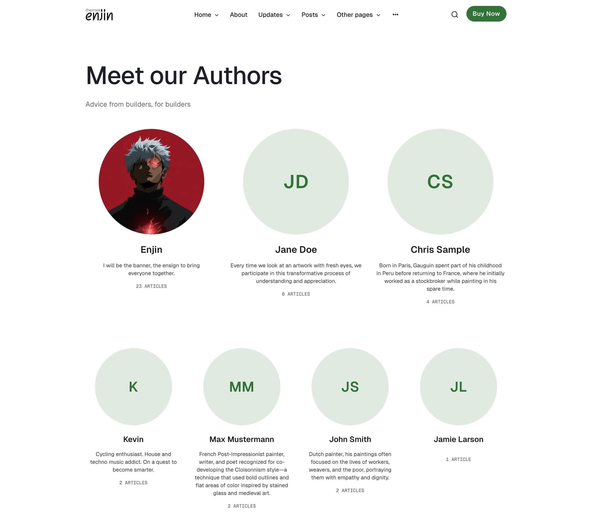
Authors section
Display your site's authors and contributors in a professional grid layout. Each author card shows their profile photo, name, bio, and post count.
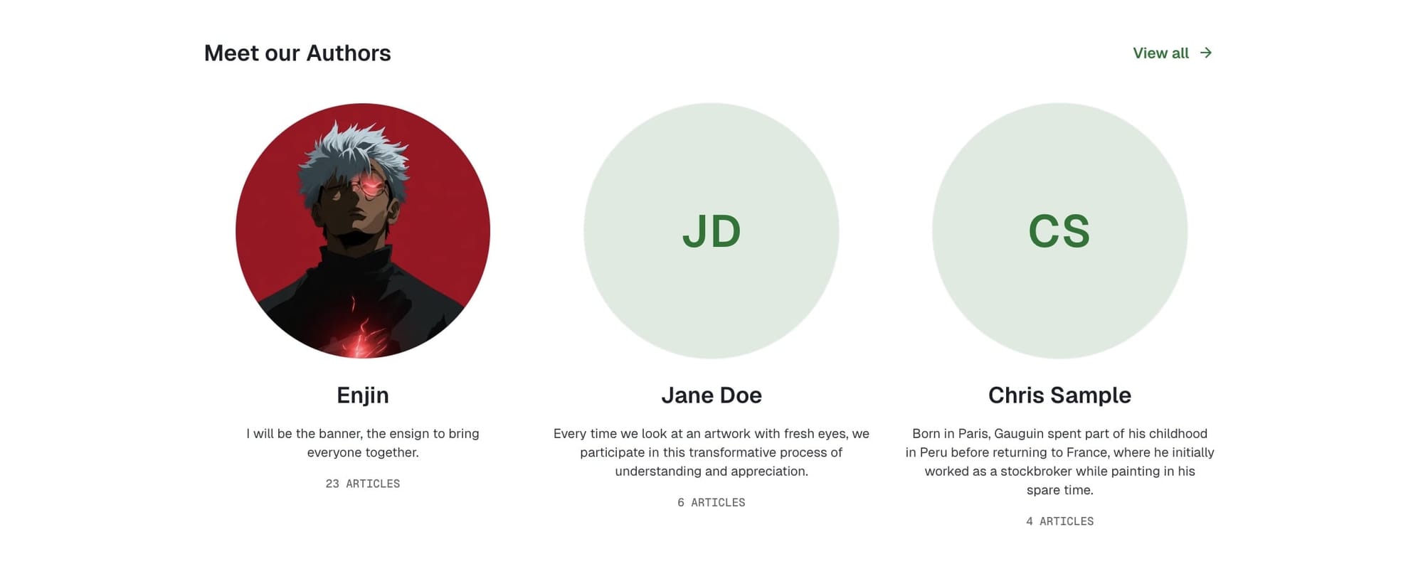
Step-by-Step to Add Authors Section
- In Ghost admin, create a new Page.
- Give it a title; this title will be the section title on the homepage (e.g., "Our Writers" or "Contributors").
- Add
#section-authorsto the Tags input. - (Optional) To add a Authors page, select ZPage Authors in Page settings / Template
- Publish.
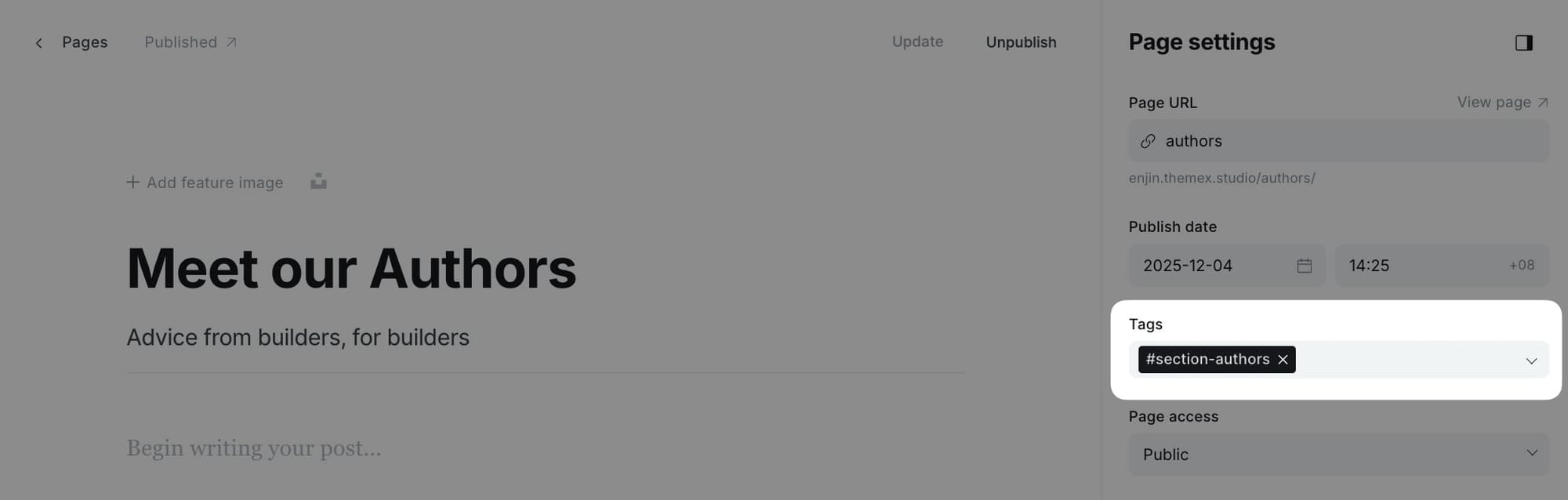
The section will automatically display the top 4 authors on your site, sorted by post count (authors with the most posts appear first).
Note: If you want to hide the section title, add #no-title tag to the page.Tag-based posts sections
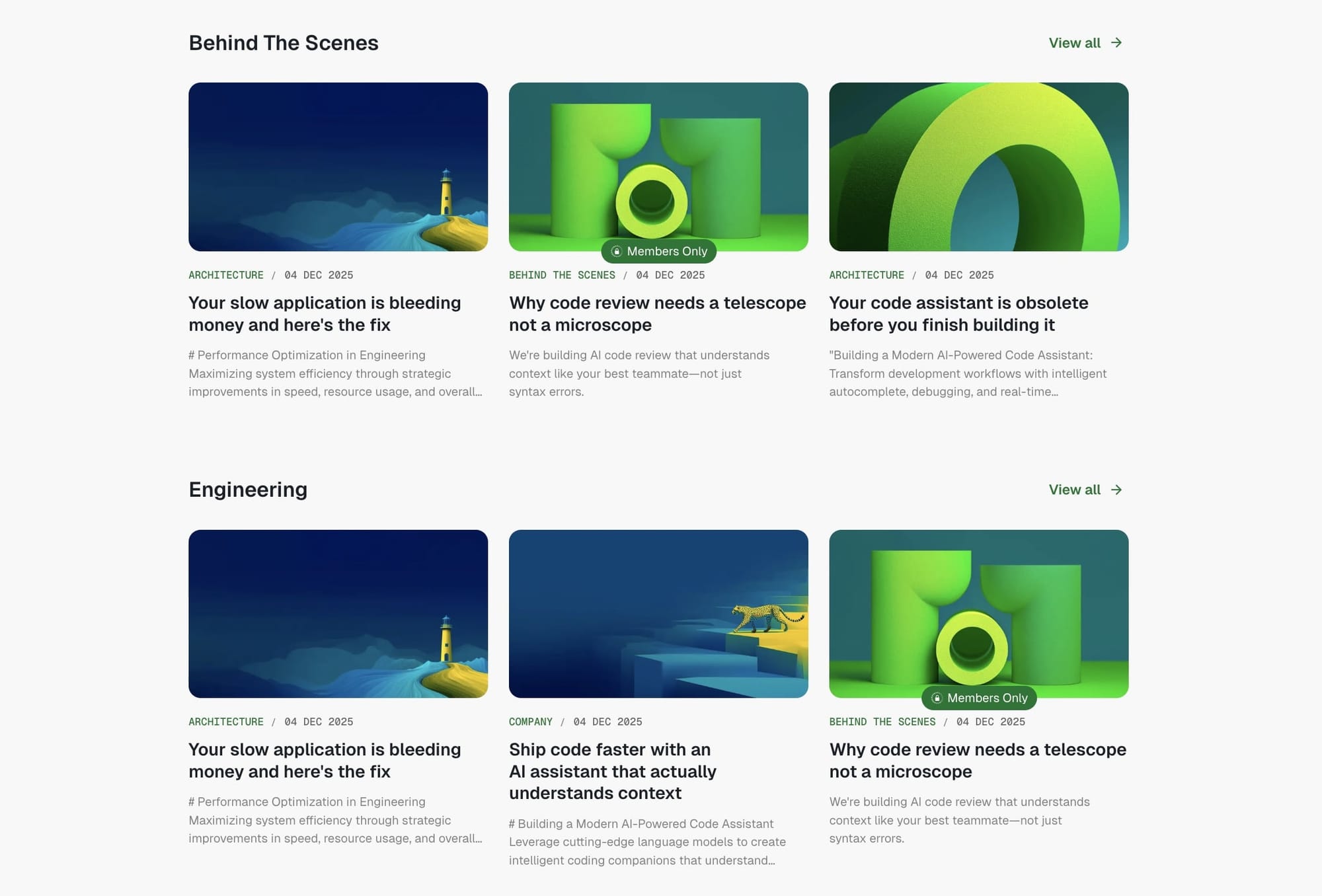
Display multiple curated collections of posts grouped by topic tags directly on your homepage. Unlike page-based sections, this feature allows you to create tag-filtered post sections simply by entering tag slugs in your theme settings—no page creation required.
This feature is perfect for:
- Showcasing content from multiple topics or categories
- Highlighting posts from specific subject areas
- Building topic-based content hubs on your homepage
How tag-based sections work
When you enter tag slugs in the theme settings, the theme automatically:
- Creates a section for each tag you specify
- Uses the tag name as the section title
- Displays the 3 most recent posts with that tag
- Adds a "View all" link to the tag archive page
The sections appear on your homepage in the order you list the tags, and each section automatically updates as you publish new posts with those tags.
Setting up tag-based sections
Step-by-step to add tag-based posts sections
- Go to Settings > Design & branding > Theme > Homepage
- Find the Home tag sections field
- Enter tag slugs separated by commas (no spaces needed)
- Example:
design,engineering,product,marketing - Click Save
Tip: To find the exact tag slug, go to Tags in the Ghost admin, click on the tag name, then copy the text in the Slug field. The slug is the URL-friendly version of your tag name (e.g., "AI Trends" becomes "ai-trends").
Configuration examples
Simple topic sections:
design,technology,lifestyle
This creates three sections showing posts tagged with "design", "technology", and "lifestyle".
Multi-word tag slugs:
web-development,product-design,case-studies,behind-the-scenes
For tags with multiple words, use the slug format with hyphens.
Custom content section
This section allows you to display any custom content of a specific page on the homepage. Use this for adding rich formatted content, HTML, or any special content blocks.
Step-by-Step to Add Custom Content Section
- In Ghost admin, create a new Page.
- Give it a title; this title won't be shown on the homepage.
- Add your custom content in the page editor (text, images, galleries, HTML cards, etc.).
- Add
#section-custom-contentto the Tags input. - Publish.
The entire content of this page will be rendered as a section on the homepage, giving you complete flexibility to add any type of content.
Advanced homepage features
The Enjin theme includes several advanced features for fine-tuning your homepage sections. These features give you precise control over which content appears, how it's sourced, and how sections are displayed.
Excluding sections from homepage
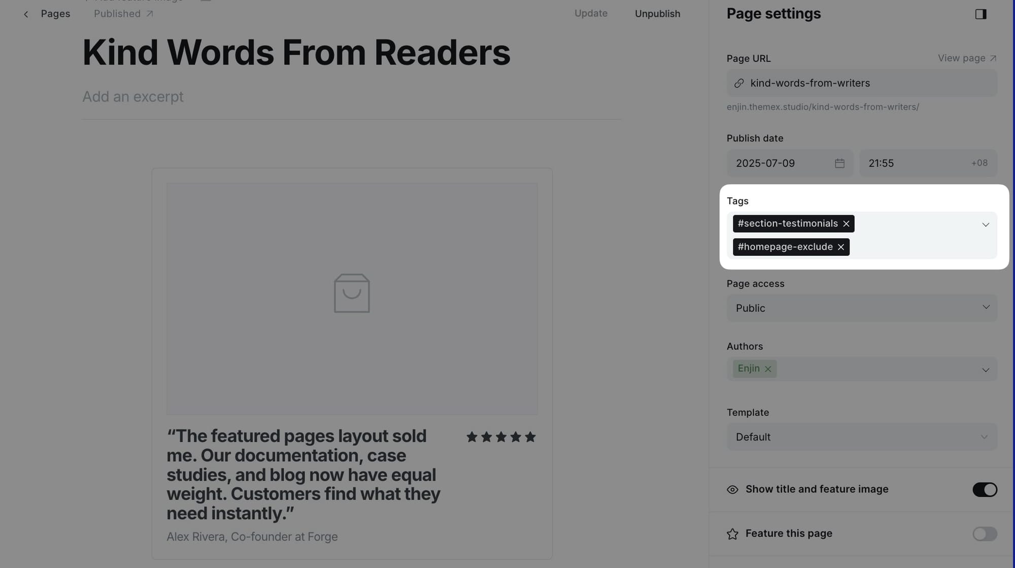
Sometimes you want to create a section page but not display it on the homepage. The #homepage-exclude tag allows you to do exactly that.
Step-by-Step to Exclude a Section from Homepage
- Create your section page as normal (e.g., with
#section-testimonialsor#section-addons) - In the page settings, add the
#homepage-excludetag along with your section tag - Publish the page
- The section will not appear on the homepage but can be accessed via its page URL
Section background colors
Each homepage section can have a custom background color by using tag accent colors. This creates visual separation between sections and allows for creative color blocking.
Step-by-Step to Add Section Background Color
- Go to Tags in Ghost admin
- Find the tag you're using in your section's page
- Click on the tag to edit it
- Set the Accent color for that tag
- Save the tag
- The section on your homepage will automatically display with that background color
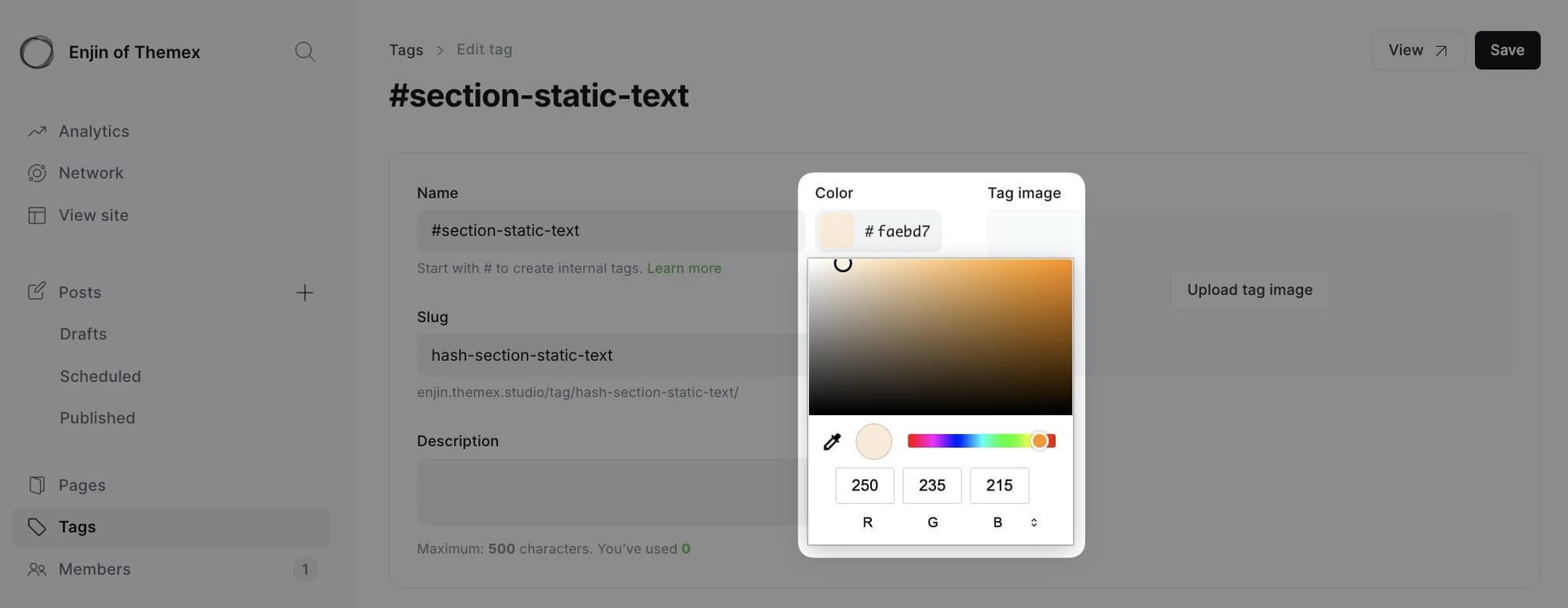
Example:
- Section: "Resources" (
#section-addons) - Tag "#section-addons" accent color: Light blue (#E3F2FD)
- Result: Resources section has light blue background
Tip: Use subtle, light colors for section backgrounds to maintain readability. Dark colors work best with dark mode.
Hiding section titles
By default, each homepage section displays its page title as the section heading. You can hide these titles using the #no-title tag for a cleaner, more minimal look.
Step-by-Step to Hide Section Title
- Create your section page as normal
- Add the
#no-titletag to the page (along with your section tag) - Publish the page
- The section content will appear without the title heading
Reordering homepage sections
By default, homepage sections appear in a predefined order. However, you can customize the order of sections without editing theme files by using CSS flexbox order property through Code Injection.
Understanding section classes
Each homepage section has a unique CSS class that you can target for reordering:
| Section | CSS Class |
|---|---|
| Hero Section | .hero-intro |
| Featured Posts | .featured-posts-section |
| Logo Wall | .section-logo-board |
| Testimonials | .section-testimonials |
| Category Navigation | .cat-nav |
| Static Text | .section-static-text |
| Static Banner | .section-static-banner |
| Add-ons | .section-addons |
| Authors | .section-authors |
| Custom Content | .section-custom-content |
How flexbox order works
The parent container .site-layout uses flexbox, allowing you to control the order of child sections using the order property. Sections with lower order values appear first, while sections with higher values appear later.
- Default order value:
0 - Lower numbers (e.g.,
-1,-2) move sections earlier - Higher numbers (e.g.,
1,2,3) move sections later
Step-by-Step to Reorder Sections
- Go to Settings > Code injection in Ghost Admin
- Add CSS code to the Site Header section
- Use the
orderproperty to rearrange sections - Click Save
Example: Basic reordering
This example moves the Latest Posts section before the Featured Posts section:
<style>
/* Reorder sections */
.hero-intro { order: 1; }
.cat-nav { order: 2; }
.latest-posts-section { order: 3; }  /* Move latest posts up */
.featured-posts-section { order: 4; } /* Move featured posts down */
.section-container { order: 5; }
</style>
Example: Advanced reordering
Move testimonials and logo wall to appear right after the hero section:
<style>
/* Hero stays at top */
.hero-intro { order: 1; }

/* Move testimonials and logos early */
.section-testimonials { order: 2; }
.section-logo-board { order: 3; }

/* Category nav and posts sections follow */
.cat-nav { order: 4; }
.featured-posts-section { order: 5; }
.latest-posts-section { order: 6; }

/* Other sections at the end */
.section-static-text { order: 7; }
.section-static-banner { order: 8; }
.section-addons { order: 9; }
.section-blocks { order: 10; }
.section-custom-posts { order: 11; }
.section-authors { order: 12; }
.section-custom-content { order: 13; }
</style>
Post templates
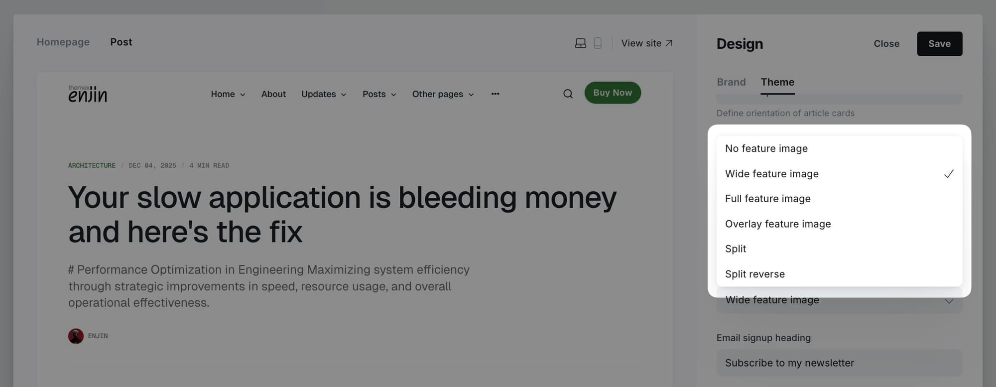
The theme provides 6 different post layout options to showcase your content in unique ways.
Available post templates:
- No feature image - Clean text-focused layout without feature image
- Wide feature image - Feature image spanning content width
- Full feature image - Feature image spanning full viewport width
- Overlay feature image - Feature image with overlay text effect
- Split - Content and image in two-column layout
- Split reverse - Split layout with image on left
Setting default post layout
You can set a default post layout that applies to all new posts.
Step-by-Step to Set Default Post Layout:
- Go to Settings > Design & branding > Theme > Post
- Find Default post hero layout
- Select your preferred default layout
- Click Save
Choosing layout for individual posts
To choose which template to use when you publish a specific post:
- In the post editor page, click the icon in the top right corner to open the Post settings.
- Find the Template selector and choose the style you want for your post.
- Publish or update your post.
Note: Layouts with "color" generate a unique background color based on the dominant color of your feature image, creating a cohesive visual experience.
Post page options
The theme supports additional post customizations to control what appears on post pages.
Step-by-Step to Customize Post Options
- Go to Settings > Design & branding > Theme > Post
- Toggle options:
- Show author - Display author card with bio and social links
- Click Save
Table of contents
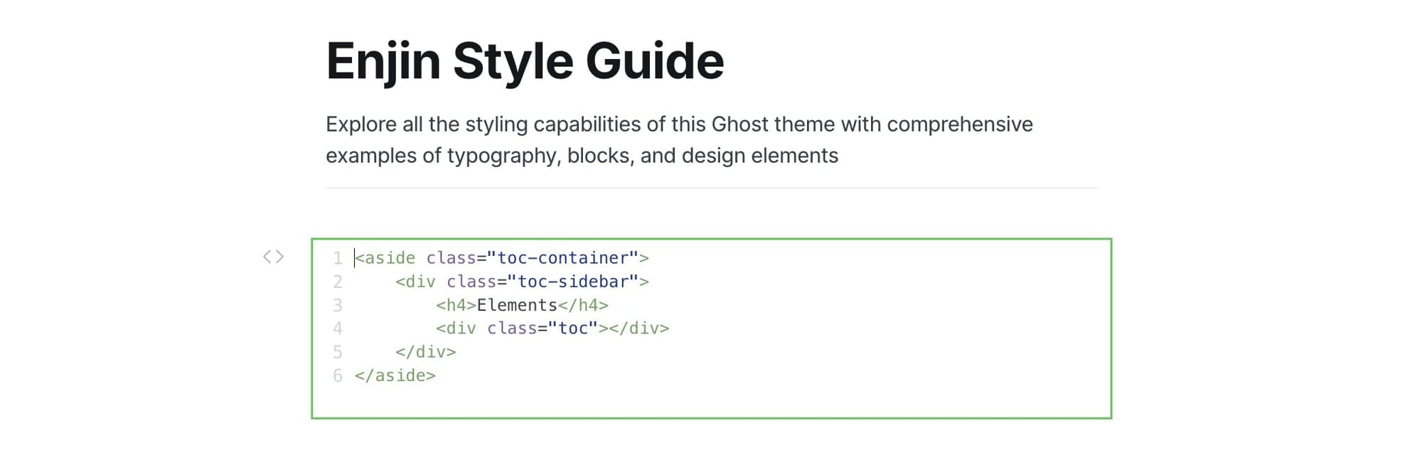
You can add a table of contents (TOC) to any post for better navigation through long-form content. The TOC automatically generates from h2 and h3 headings in your post.
Step-by-Step to Add Table of Contents
- Create a new post and write your post using h2 and h3 headings
- Right under the title, add an HTML card
- Insert the following code:
<aside class="toc-container">
    <div class="toc-sidebar">
        <h4>On this page</h4>
        <div class="toc"></div>
    </div>
</aside>
- Publish and review it
Note: The TOC will automatically populate with links to all h2 and h3 headings in your post. You can change the title "On this page" to any text you prefer, or remove the h4 element entirely for a TOC without a title.
Customizing TOC heading levels
By default, the table of contents displays only h2. If you want to show only specific heading levels (for example, show both h2 and h3 headings), you can customize this using Code Injection.
Step-by-step to customize TOC headings
- Go to Settings > Code injection in Ghost Admin
- Add the following code to the Site Header section:
<script>
window.tocbotConfig = {
    headingSelector: 'h2, h3'
};
</script>
- Modify the
headingSelectorvalue to match your needs:'h2'- Only h2 headings'h2, h3'- Both h2 and h3 headings (default)'h2, h3, h4'- h2, h3, and h4 headings
- Click Save
That's it! You only need to specify the setting you want to change. The theme will automatically merge your custom configuration with the default settings.
Note: This code must be added to the Site Header section (not Site Footer) so it loads before the theme's TOC initialization script.
Videos for posts and pages hero
You can use a videos as the feature media to your posts and pages to create engaging, dynamic content. Videos will autoplay when visitors scroll to them and pause when scrolled out of view. This feature works on post hero sections, post cards, and collection pages.
Step-by-step to add a video
- Create or edit a post or page in Ghost admin
- Add a feature image (this will be used as the video poster frame)
- Click the settings icon (⚙️) in the top right corner to open Post/Page settings
- Scroll to the Meta data section
- In the Facebook description field, paste the direct URL to your video file (e.g.,
https://example.com/video.mp4) - Update or publish your post/page
![TK: Video settings example]
Note: The Facebook description field (og_description) is repurposed for video URLs. Your actual meta description should be set in the Excerpt field instead.
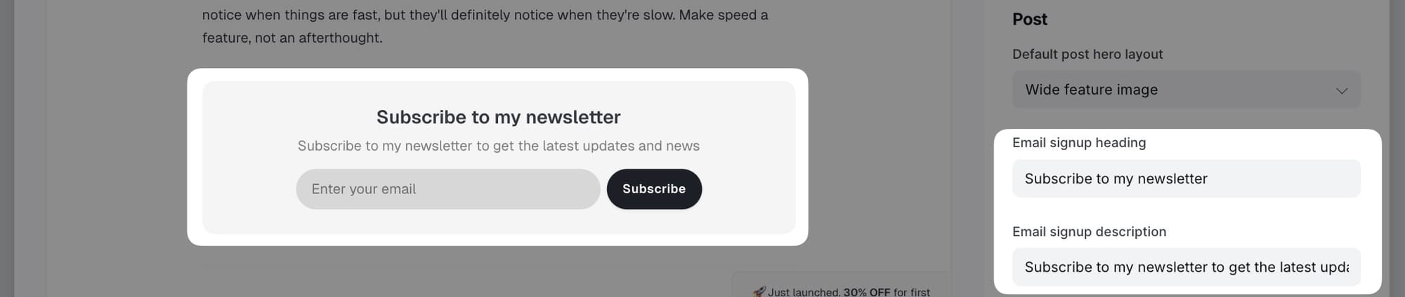
Email signup text
Customize the email subscription box that appears at the bottom of posts and on the homepage.
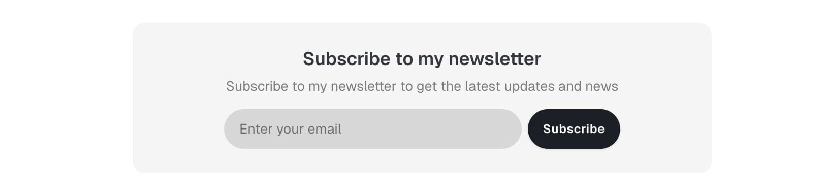
Step-by-Step to Customize Email Signup
- Go to Settings > Design & branding > Theme > Post
- Edit the following fields:
- Email signup heading - Main heading (default: "Subscribe to my newsletter")
- Email signup description - Supporting text (default: "Subscribe to my newsletter to get the latest updates and news")
- Click Save
Other templates
Individual tag pages
Each tag has its own page showing all posts with that tag.
Tag pages include:
- Tag name and description (if set)
- Count of posts
- Grid of posts with the tag
- Pagination for tags with many posts
Step-by-Step to Customize Tag Information:
- Go to Tags in Ghost admin
- Click on the tag you want to edit
- Add or edit:
- Tag name
- Tag description
- Tag image
- Click Save
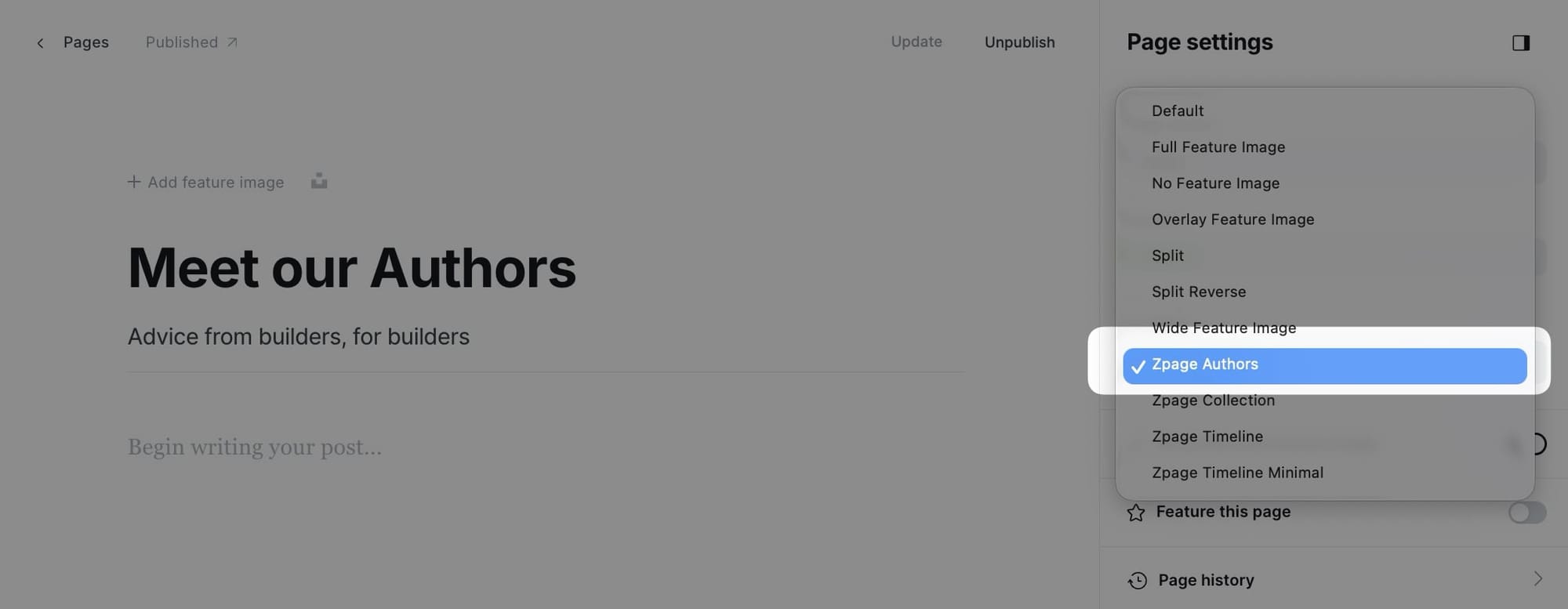
Authors template
Create a dedicated page to showcase all your site's authors and contributors using the Authors page template.
This custom template displays authors in a 4-column grid layout, showing up to 8 authors sorted by post count (most prolific authors first).
Step-by-Step to Create Authors Page:
- Go to Pages in Ghost admin
- Click New page
- Add a title (e.g., "Our Authors" or "Contributors")
- (Optional) Add a feature image
- In the Page settings sidebar (click the settings icon), find the Template dropdown
- Select Zpage Authors from the template options
- Publish
Individual author pages
Each author has their own page showing their profile and posts.
Author pages include:
- Author photo
- Author name and bio
- Social links
- Count of posts
- Grid of author's posts
- Pagination
Step-by-Step to Customize Author Information:
- Go to Settings > Staff in Ghost admin
- Click on the author you want to edit
- Add or edit:
- Profile photo
- Name
- Bio
- Location
- Website
- Social media links (Twitter, Facebook, LinkedIn, etc.)
- Click Save
Collection template
Create curated collection pages that display posts filtered by specific tags. This template is perfect for creating topic-based collections, featured content galleries, or any custom grouping of posts.
The Collection page template allows you to:
- Add custom introductory content at the top of the page
- Display posts filtered by one or more tags
Step-by-Step to Create Collection Page:
- Go to Pages in Ghost admin
- Click New page
- Add a title for your collection (e.g., "Featured Articles" or "Design Resources")
- (Optional) Add introductory content in the page editor—this appears above the filtered posts
- (Optional) Add a feature image
- In the Page settings sidebar (click the settings icon), find the Template dropdown
- Select Zpage Collection from the template options
- In the Twitter description field, enter the tag slug(s) you want to filter posts by
- Single tag:
design - Multiple tags:
design+technology
- Single tag:
- Publish
Specifying which posts to display
The Collection template uses the Twitter description field to determine which posts to show. This is a clever use of an existing Ghost field.
Examples:
- To show all posts tagged "featured": Enter
featuredin Twitter description - To show posts with "design" OR "technology": Enter
design,technology - To show posts with "design" AND "technology": Enter
design+technology
Timeline templates
The Enjin theme includes two specialized timeline templates for displaying content in chronological order. These templates are perfect for journey documentation, timeline, history, or any content where chronological presentation matters.
Timeline (full content) template
The full content timeline template displays posts or pages in expanded format, showing the complete content of each entry. This creates an immersive, story-like reading experience perfect for project logs, series, or detailed journeys.
Use cases for full content timeline:
- Project development logs showing progress over time
- Tutorial series where each step builds on the previous
- Journey documentation (travel blogs, learning journeys)
- Company history or milestone timeline
- Portfolio showcases with detailed case studies
- Behind-the-scenes content series
Step-by-Step to Create Full Content Timeline Page:
- Go to Pages in Ghost admin
- Click New page
- Add a title for your timeline (e.g., "Project Journey" or "Development Log")
- (Optional) Add introductory content in the page editor—this appears above the timeline
- (Optional) Add a feature image
- In the Page settings sidebar (click the settings icon), find the Template dropdown
- Select Zpage Timeline from the template options
- In the Twitter description field, enter the tag slug for content you want to display (e.g.,
project-alpha) - (Optional) To show pages instead of posts, add the
#source-pagestag to your page - Publish
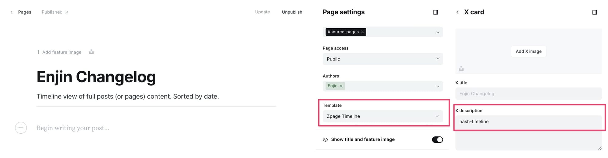
Twitter description examples:
- Single tag:
project-updates- Shows all posts tagged with "project-updates" - Multiple tags:
development,frontend- Shows posts with BOTH tags
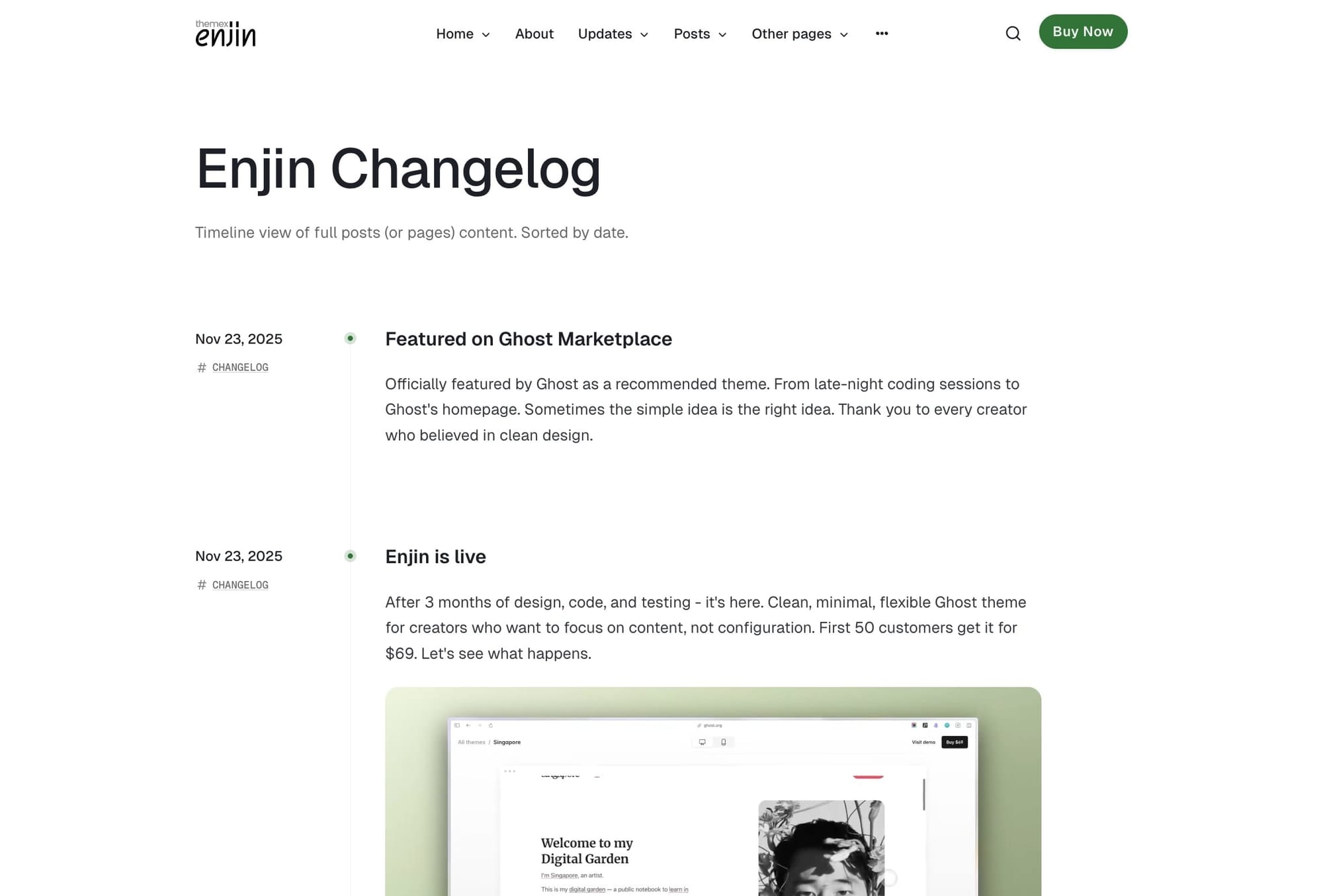
Note: The timeline template shows posts by default. Add the #source-pages tag to your timeline page to show pages instead.Timeline minimal template
The minimal timeline template displays a compact list view showing only titles, dates, and brief excerpts. This creates a clean, scannable overview perfect for changelogs, resumes, or long lists of entries.
Use cases for minimal timeline:
- Changelog or version history
- Resume or CV (work history, education)
- Life events or personal milestones
- Publication archive
- Company news timeline
- Quick reference lists
Step-by-Step to Create Minimal Timeline Page:
- Go to Pages in Ghost admin
- Click New page
- Add a title for your timeline (e.g., "Changelog" or "Work History")
- (Optional) Add introductory content in the page editor
- (Optional) Add a feature image
- In the Page settings sidebar, find the Template dropdown
- Select Zpage Timeline Minimal from the template options
- In the Twitter description field, enter the tag slug for content you want to display
- (Optional) Add the
#source-pagestag to show pages instead of posts - Publish
Custom settings
Posts per page
By default, the homepage and other listing pages display a maximum of 12 posts per page, but you can change this number.
Step-by-Step to Change Posts Per Page
- You'll need to open the theme's
package.jsonfile in your code editor and find the following:
"config": {
    ...
    "posts_per_page": 12
    ...
}
- Change the value of
12to your expected value. - Save your
package.jsonfile in the root folder. - Re-zip the theme and upload it to Ghost.
Google analytics
To integrate Google Analytics, I recommend using the Google Analytics integration by Ghost.
This official integration allows you to:
- Add your Google Analytics tracking ID
- Track pageviews automatically
- Monitor user behavior
- No code editing required
Syntax highlighting
You can add a fenced code block by placing triple backticks ``` before and after the code block.
Basic code block (no highlighting)
pre {
  background-color: #f4f4f4;
  max-width: 100%;
  overflow: auto;
}
This will produce a gray code block without syntax highlighting.
Highlighted code block
To highlight a code block, add a language alias like css or js after the opening backticks. For example:
```css
pre {
  background-color: #f4f4f4;
  max-width: 100%;
  overflow: auto;
}
```
This will produce a colored, syntax-highlighted code block.
Inline code
To add inline code, wrap the text between two backticks "`".
For example: const myVariable = 'value';
Prism.js
The theme ships with Prism.js, a lightweight, robust, and elegant syntax highlighter.
The initial Prism package includes some languages, like Markup, CSS, C-like, and JavaScript.
You can add support for more languages by adding the Prism autoloader script, which will automatically load the languages you need.
Step-by-Step to Enable Autoloader:
- Go to Settings > Code injection
- Add the following script to the Site Footer section:
<script src="https://cdnjs.cloudflare.com/ajax/libs/prism/1.28.0/plugins/autoloader/prism-autoloader.min.js" integrity="sha512-fTl/qcO1VgvKtOMApX2PdZzkziyr2stM65GYPLGuYMnuMm1z2JLJG6XVU7C/mR+E7xBUqCivykuhlzfqxXBXbg==" crossorigin="anonymous" referrerpolicy="no-referrer"></script>
- Click Save.
Now Prism will automatically load syntax highlighting for any programming language you use in code blocks.
Responsive tables
The responsive table will display a horizontal scroll bar if the screen is too small to display the full content. The following description applies to the table added using the markdown card.
By default, the table adapts to the window width. If you have a table that is too wide, it will display a horizontal scroll bar when needed.
Step-by-Step to Add Responsive Table
- In your post or page editor, add a Markdown card.
- Add the markdown to create a table. To generate a table, you can use the tool Markdown Tables Generator. Below is an example:
| # | Heading | Heading | Heading | Heading | Heading |
|:--|:--------|:--------|:--------|:--------|:--------|
| 1 | Cell    | Cell    | Cell    | Cell    | Cell    |
| 2 | Cell    | Cell    | Cell    | Cell    | Cell    |
| 3 | Cell    | Cell    | Cell    | Cell    | Cell    |
- Publish your post or page.
Member comments
The theme comes with Ghost Native Comments integration.
Step-by-Step to Enable Comments:
- Go to Settings > Membership > Access
- Click Edit next to your membership settings
- Find the Commenting section
- Choose who can comment:
- All members
- Paid members only
- Nobody (disable comments)
- Click Save
Comments will appear at the bottom of post pages when enabled.
Languages
The theme is fully translatable by enabling a publication language in the settings of the Ghost Admin. Before that, you must prepare your language file.
Step-by-Step to Add Translation
- Inside the
../locales/folder, add target language files for each translatable language used on your site. For example,fr.jsonis for French, andpl.jsonis for Polish. ISO 639-1 language code must be used. - Translate the sentences used in the theme inside your new language files. For example, in
en.json:
{
    "Subscribe": "Subscribe",
    "Sign in": "Sign in",
    "Account": "Account",
    "Browse": "Browse",
    ...
}
- Edit to translate into your target language (French example for
fr.json):
{
    "Subscribe": "S'abonner",
    "Sign in": "Se connecter",
    "Account": "Compte",
    "Browse": "Parcourir",
    ...
}
- Upload the theme with the new language file.
- Go to the General settings in the Ghost Admin.
- At the top of the page, you'll see the Publication info section.
- Enter the correct language code into your Publication language settings menu.
- Finally, click Save to activate.
Note: If you edited the active language, you must restart Ghost to make the changes effective. Alternatively, enter another language code and click Save to activate, then switch back to your code.
Advanced settings
Editing a theme's code
You will encounter information about editing theme files in many places in this documentation.
To edit files, you will need to unzip the theme archive – at this point, you will have access to the necessary files indicated in the theme documentation.
Edit HTML/Handlebars files
Step-by-Step to Edit Theme Files
- To edit your theme files, download a copy of the theme. For this purpose, go to the Design settings in the Ghost Admin and click Change theme in the bottom left corner.
- Use the Advanced dropdown menu in the upper right corner to download your theme, then unzip the theme locally.
- Once the theme is unzipped, the files can be edited using a code editor – make the changes indicated in the theme documentation.
Recommended Code Editors: You can edit files using applications such as Sublime Text, Visual Studio Code, or Brackets. Using native text editors like TextEdit on macOS may add formatting that may cause the theme to work incorrectly.
- After changing the theme code, re-zip the theme directory to upload it back to Ghost.
Creating Zip Archives: To create a zip archive on macOS, right-click on the theme folder to view the context menu, then click the Compress option. On Windows, right-click on the theme folder, select Send to, and then select Compressed (zipped) folder.
- To upload the modified theme, go to the Design settings in the Ghost Admin and click Change theme in the bottom left corner.
- Click the Upload theme button in the upper right corner.
- Once uploaded, click Activate to activate the theme on your site.
Edit CSS
The best way to make minor CSS changes is to use Ghost's built-in Code injection. The change will be applied right after you save.
If you need more powerful CSS customization, you can edit CSS files in the theme directory. This requires a more technical setup.
Follow this guide: How to apply CSS changes in your Ghost theme
Tip: If you're only looking to make minor updates to a theme, code injection may be enough.
Code injection
Code injection is a powerful feature for customization without editing theme files directly.
For a CSS example, you can use the code in the Site Header section to change colors and styling.
Example: Change title color and size
- Go to Settings > Code injection
- Add this code to the Site Header section:
<style>
  .head-logo-wrap .logo-text {
    color: #4550E5;
    font-size: 3.2rem;
  }
</style>
- Click Save
Check out How to use Code Injection Ghost guide for more information.
Theme deploy with GitHub Actions
Enjin comes integrated with the Deploy Ghost Theme GitHub action. The purpose of the GitHub action is to take the theme from the GitHub repo and send it to your website automatically.
This allows you to:
- Edit theme files locally
- Push changes to GitHub
- Automatically deploy to your Ghost site
- Version control your theme customizations
Follow this guide to set up GitHub Actions: Streamline the deployment of your Ghost theme using GitHub Action
- Set Meta Descriptions: Always add custom excerpts to posts and pages for better search results
- Use Descriptive Titles: Write clear, descriptive titles that include relevant keywords
- Add Alt Text: Include descriptive alt text for all images
- Internal Linking: Link between related posts to improve site structure
Congratulations on setting up your Enjin theme! We hope this documentation has been helpful in getting you started with creating a beautiful and functional website.
Enjin is designed to be flexible and easy to customize, offering a wide range of options to make your site unique. With its customizable homepage sections, multiple post layouts, and extensive customization options, you have everything you need to create a professional online presence that showcases your content like it matters.
If you need additional support or have questions, please visit Themex Studio or consult the Ghost Help Center.
Become a subscriber receive the latest updates in your inbox.